Quantcast
Channel: Mihail Mateev
Viewing all 30 articles
Browse latest View live

Theming and Customization jQuery Date Picker Control

$
0
0


The igDatePicker allows you to have an input field with a dropdown calendar and a specified date format display. The igDatePicker control supports localization by recognizing different regional options exposed from the browser and also supports validation.

The igDatePicker control extends the functionality of the igDateEditor control and requires the jQuery UI Datepicker script to be included in the page (jquery.ui.datepicker.js).

The Ignite UI  DatePicker control depends on jquery.datepicker an thus also requires its localization files to be referenced on the page. The Infragistics Date Picker reuses the drop-down calendar from jquery.datepicker as it doesn’t implement its own drop-down.


  • Prerequisites


You need to add these resources to use Ignite UI Date Picker with styling


<!-- Ignite UI Required Combined CSS Files --><link href="http://cdn-na.infragistics.com/igniteui/latest/css/themes/infragistics/infragistics.theme.css" rel="stylesheet" /><link href="http://cdn-na.infragistics.com/igniteui/latest/css/structure/infragistics.css" rel="stylesheet" /><script src="http://modernizr.com/downloads/modernizr-latest.js"></script><script src="http://code.jquery.com/jquery-1.9.1.min.js"></script><script src="http://code.jquery.com/ui/1.10.3/jquery-ui.min.js"></script><!-- Ignite UI Required Combined JavaScript Files --><script src="http://cdn-na.infragistics.com/igniteui/latest/js/infragistics.core.js"></script><script src="http://cdn-na.infragistics.com/igniteui/latest/js/infragistics.lob.js"></script>


You can create an instance of igDatePicker using the code below:


$(function () {

            $("#datePicker").igDatePicker();

});


IgDatePicker-Pic01


The igDatePicker control exposes a rich client-side API, which may be configured the work with any server technology. While the IgniteUI controls are server-agnostic, the editor control does feature wrappers specific for the Microsoft ASP.NET MVC Framework to configure the control with the .NET language of your choice.

The Date Picker control may be extensively styled giving you an opportunity to provide a completely different look and feel for the control as opposed to the default style. Styling options include using your own styles as well as styles from jQuery UI’s ThemeRoller.


This blog is focused mainly about how to style igDatePicker , how to change the visualization  of some  the most popular Date Picker parts  and more useful examples.


As it was mentioned above, the igDatePicker control is a jQuery-based widget that extends the igDateEditor control and it exposes a number of options for styling. To customize style of the numeric editor you must use theme option to apply custom CSS rules to the control. Ignte UI DatePicker control reuses the drop-down calendar from jquery.datepicker and you should use style options available for jquery.datepicker.


  • Theming


Infragistics offers the following themes you can include:

  • Infragistics Theme
  • Infragistics 2012 Theme
  • Metro Theme
  • iOS Theme
  • Bootstrap Themes:
    • Default
    • Superhero
    • Yeti
    • Flatly


The Ignite UI DatePickers offers full theming support. That means almost all its elements could be restyled using theming.


More info around theming for Ignite UI  is described in this post.

The following code snippet includes the Infragistics theme and structure files in your file:

In HTML:


<link href="{IG Resources root}/css/themes/infragistics/infragistics.theme.css" 
     rel="stylesheet" type="text/css" /><link href="{IG Resources root}/css/structure/infragistics.css" 
     rel="stylesheet" type="text/css" />

For loading the resources with the Loader, use the following code to include the igLoader script in the page:

If you are using Infragistics loader you need to set cssPath and scriptPath options, which is relative to the page that instantiates the loader.


<script type="text/javascript">
    $.ig.loader({
        scriptPath: "/Scripts/ig/",
        cssPath: "/Content/ig/",
        resources: "igEditors"
    });</script>


If you need to use predefined themes you need to add also the specified theme:


<script type="text/javascript">
    $.ig.loader({
        scriptPath: "/Scripts/ig/",
        cssPath: "/Content/ig/",
        resources: "igEditors",
	theme: "metro"
    });</script>


The styled Date Picker is shown below:


IgDatePicker-Pic02


Changing theme is not supported when base element is INPUT or TEXTAREA and renderInContainer or button are not enabled.


//Initialize
$(".selector").igDateEditor({
    theme : "redmond"
});
//Get
var theme = $(".selector").igDateEditor("option", "theme");
//Set
$(".selector").igDateEditor("option", "theme", "redmond");


  • Changing the Theme Programmatically


The code below is an example how to set a custom theme named, customTheme, when the mouse hovers over the control.


<style type="text/css">
    .customTheme .ui-igedit-hover
    { 
        background: #f0ffff; 
        border-color:#a0a0a0; 
    }

    .customTheme .ui-igedit-fieldincontainer
    { 
        height:18px; 
        float:left; 
        padding-top:0px; 
        padding-bottom:0px; 
        margin:0px; 
        color:#1CC2FF;
    }
</style><body><input type="text"  id="datepicker"  /></body>


You can use the approach  shown below to change the theme during initialization:


$('#datepicker').igDatePicker({
     width: 160,
     regional: 'en-US', 
        theme: 'customTheme'
});


The result is shown below:

IgDatePicker-Pic03


If the control is already created in the DOM, then you can change the theme at any time using the approach shown:


//use this approach
//when the control is already created in the DOM
$('#datepicker').igDatePicker('option', 'theme', 'customTheme');


  • Using ThemeRoller


The igDatePicker control can also be fully styled using the jQuery UI ThemeRoller. The next snippet demonstrates how to change the theme of a control from a Theme Switcher dropdown.


Set picker theme with jQuery UI ThemeRoller via HTML


<body><input type="text"  id="datepicker"  /><div id="themeRoller" /></body>


In JavaScript - Initialize igDatePicker:


$('#datepicker').igDatePicker({
    width: 160,
    regional: 'en-US'
});
$('#themeRoller').themeswitcher();


Click on this image to get a fully supported trial version of Infragistics Ignite UI controls:

http://www.igniteui.com/


How to Customize Ignite UI Bullet Graph Control

$
0
0

The Ignite UI Bullet Graph (igBulletGraph) control is an Ignite UI component which allows for visualizing data in the form of a bullet graph. Linear by design, it provides a simple and concise view of a primary measure or measures compared against a scale and, optionally, some other measure. This control is similar to the Linear Gauge but apart from the current value it also shows a target value which can serve as a point to reach or a measurement . It is usually used to compare two values one represented by a horizontal bar and another represented by a vertical line. You can display the chart separately or you can insert it in a Grid and thus create a graphical table for even better UX.


This blog will cover several main settings, used to configure and customize igBulletGraph components:

  • Configure Basic Settings
  • Scale Labeling Settings
  • Tick Marks Settings
  • How to change igBulletGraph Orientation
  • Configuring the jQuery Bullet Graph Background


Before to start:

To be possible to add igBulletGraph to your web application, you need the required JavaScript and CSS files referenced on the HTML page.


<!DOCTYPE html><html><head><!-- Ignite UI Required Combined CSS Files --><link href="../../igniteui/css/themes/infragistics/infragistics.theme.css" rel="stylesheet" /><link href="../../igniteui/css/structure/infragistics.css" rel="stylesheet"/><script type="text/javascript" src="../../js/jquery.min.js"></script><script type="text/javascript" src="../../js/jquery-ui.js"></script><!-- Bullet Graph Required JavaScript Files --><script src="../../igniteui/js/modules/infragistics.util.js" type="text/javascript"></script><script src="../../igniteui/js/modules/infragistics.dv.simple.core.js" type="text/javascript"></script><script src="../../igniteui/js/modules/infragistics.gauge_bulletgraph.js" type="text/javascript"></script><script src="../../igniteui/js/modules/infragistics.ui.bulletgraph.js" type="text/javascript"></script></head><body><!-- your implementation here --></body></html>


To add a Bullet Graph to your page you need to  create an element within the HTML body on which to instantiate the igBulletGraph control.


<body><!-- Target element for the igBulletGraph --><div id="bulletGraph"></div></body>


Next you need to instantiate the igBulletGraph control.


<script type="text/jscript">
     $(function () {                        
               $("#bulletGraph").igBulletGraph({
         });
         });</script>


  • Configure Basic Settings


When instantiating the igBulletGraph, configure the width and height options.
In HTML:

$("#bulletGraph").igBulletGraph({
     width: "320px",
     height: "80px"
 });


Configure the scale: You need to set its minimumValue and maximumValue properties. For example, the scale will start at 5 and end at 55.

$("#bulletGraph").igBulletGraph({
     width: "300px",
     height: "70px",
     minimumValue: "5",
     maximumValue: "55"
 });


Add a performance bar: The primary measure of the igBulletGraph is visualized by its performance bar. Its value is managed by the value property setting.

$("#bulletGraph").igBulletGraph({…
     value:"35"
 });


Configure the comparative marker: To position the comparative measure marker on the scale is managed by the value of the targetValue property.

$("#bulletGraph").igBulletGraph({…
     targetValue:"43"
 });


Add comparative ranges: Comparative ranges are managed by ranges property within which several individual ranges can be defined, each of which having its own starting and ending values (startValue and endValue) and color (brush).


$("#bulletGraph").igBulletGraph({…
     ranges: [{
         name: 'range1',
         startValue: 0,
         endValue: 15,
         brush: '#DCDCDC'
     },
     {
         name: 'range2',
         startValue: 15,
         endValue: 30,
         brush: '#A9A9A9'
     },
     {
         name: 'range3',
         startValue: 30,
         endValue: 55,
         brush: '#808080'
     }
     ]
 });


The final result looks like the bullet graph at the picture below:


  • Scale Labeling Settings


You can control the labeling settings as

formatLabel:

formatLabel: function (evt, ui) {
	ui.label = "$" + ui.label;
	if (ui.value != 90000000) {
		var re = /000$/;
		ui.label = ui.label.replace(re, " K");
	}
}


and alignLabel

alignLabel: function (evt, ui) {
	// center the just the number part according to its tick, instead of centering the whole label
	if (ui.value == 90000000) {
		ui.offsetX += 20;
	}
}


The full code is available below:


$bulletGraph.igBulletGraph({
                    height: "80px",
                    width: "100%",
                    interval: 15000000,
                    fontBrush: "#164F6D",
                    formatLabel: function (evt, ui) {
                        ui.label = "$" + ui.label;
                        if (ui.value != 90000000) {
                            var re = /000$/;
                            ui.label = ui.label.replace(re, " K");
                        }
                    },
                    alignLabel: function (evt, ui) {
                        // center the just the number part according to its tick, instead of centering the whole label
                        if (ui.value == 90000000) {
                            ui.offsetX += 20;
                        }
                    },
                    ranges: [
                        {
                            name: 'range1',
                            startValue: 0,
                            endValue: 45000000,
                            brush: '#164F6D'
                        },
                        {
                            name: 'range2',
                            startValue: 45000000,
                            endValue: 60000000,
                            brush: '#20789F'
                        },
                        {
                            name: 'range3',
                            startValue: 60000000,
                            endValue: 100000000,
                            brush: '#36A5D5'
                        }
                    ],
                    maximumValue: 100000000,
                    targetValue: 75000000,
                    value: 73000000,
                    transitionDuration: 500,
                    valueBrush: "white",
                    valueOutline: "white",
                    targetValueBrush: "white",
                    targetValueOutline: "white"
 });


The picture below demonstrates Ignite UI Bullet Graphs with different formatting of the labels:


igBulletGraph-Pic01


  • Tick Marks Settings

Tick marks  has many settings that allow you to configure it:

  • tickStartExtent: Gets or sets the position at which to start rendering the major tickmarks as a value from 0 to 1, measured from the front/bottom of the gauge
  • tickEndExtent:  Gets or sets the position at which to stop rendering the major tickmarks as a value from 0 to 1
  • ticksPostInitial: A value to start adding tickmarks, added to the scale's MinimumValue
  • ticksPreTerminal: A value to stop adding tickmarks, subtracted from the scale's MaximumValue.
  • tickStrokeThickness: Gets or sets the stroke thickness to use when rendering ticks.
  • tickBrush: Gets or sets the brush to use for the major tickmarks.
  • minorTickCount: Gets or sets the number of minor tickmarks to place between major tickmarks.
  • minorTickStartExtent: Gets or sets the position at which to start rendering the minor tickmarks as a value from 0 to 1, measured from the front/bottom of the gauge.
  • minorTickEndExtent: Gets or sets the position at which to stop rendering the minor tickmarks as a value from 0 to 1, measured from the front/bottom of the gauge.
  • minorTickStrokeThickness: Gets or sets the stroke thickness to use when rendering minor ticks
  • minorTickBrush: Gets or sets the brush to use for the minor tickmarks.


The whole code is available below:

        $(function () {
            $("#bulletgraph1").igBulletGraph({
                height: '80px',
                width: '100%',
                // The interval to use for the ticks. Default value is calculated, rather than predefined, to show 11 ticks based on the minimum and maximum values (in this case value would equal to 75)
                //interval: 75,
                // Gets or sets the position at which to start rendering the major tickmarks as a value from 0 to 1, measured from the front/bottom of the gauge.
                // Values further from zero than 1 can be used to make this extend further than the normal size of the gauge.
                tickStartExtent: 0.02,
                // Gets or sets the position at which to stop rendering the major tickmarks as a value from 0 to 1, measured from the front/bottom of the gauge.
                // Values further from zero than 1 can be used to make this extend further than the normal size of the gauge.
                tickEndExtent: 0.2,
                // A value to start adding tickmarks, added to the scale's MinimumValue.
                ticksPostInitial: 0,
                // A value to stop adding tickmarks, subtracted from the scale's MaximumValue.
                ticksPreTerminal: 0,
                // Gets or sets the stroke thickness to use when rendering ticks.
                tickStrokeThickness: 2,
                // Gets or sets the brush to use for the major tickmarks.
                tickBrush: 'black',
                // Gets or sets the number of minor tickmarks to place between major tickmarks.
                minorTickCount: 3,
                // Gets or sets the position at which to start rendering the minor tickmarks as a value from 0 to 1, measured from the front/bottom of the gauge.
                // Values further from zero than 1 can be used to make this extend further than the normal size of the gauge.
                minorTickStartExtent: 0.06,
                // Gets or sets the position at which to stop rendering the minor tickmarks as a value from 0 to 1, measured from the front/bottom of the gauge.
                // Values further from zero than 1 can be used to make this extend further than the normal size of the gauge.
                minorTickEndExtent: 0.2,
                // Gets or sets the stroke thickness to use when rendering minor ticks.
                minorTickStrokeThickness: 1,
                // Gets or sets the brush to use for the minor tickmarks.
                minorTickBrush: '#EBEBEB',
                ranges: [
                    {
                        name: 'range1',
                        startValue: 0,
                        endValue: 450 
                    },
                    {
                        name: 'range2',
                        startValue: 450,
                        endValue: 600,
                    },
                    {
                        name: 'range3',
                        startValue: 600,
                        endValue: 750
                    }
                ],
                maximumValue: 750,
                targetValue: 550, 
                value: 555 
            });
 });


The picture below shows different settings of igBulletGraph tick marks:


  • How to change igBulletGraph Orientation


Property “orientation” can be used to change orientation using values “horizontal” or “vertical”.


$(function () {

            $("#bulletgraph").igBulletGraph({
                height: "300px",
                width: "60px",
                orientation: "vertical", 
                value: 85,
                targetValue: 77,
                ranges: [
                    {
                        name: 'bad',
                        startValue: 0,
                        endValue: 33
                    },
                    {
                        name: 'acceptable',
                        startValue: 33,
                        endValue: 70
                    },
                    {
                        name: 'good',
                        startValue: 70,
                        endValue: 100
                    }],
                transitionDuration: 200, 
            });
});


  • How to configure the Ignite UI Bullet Graph Background


The background of the igBulletGraph control is configurable in terms of spread and position and look-and-feel (fill and border). The spread and position are configurable in the dimension across the scale (through the backingInnerExtent and backingOuterExtent properties); along the scale, the background always spreads from one edge of the control to the other. The fill color and the border are managed by a set of properties available in the style template.

The following picture demonstrates a background color of a variety of orange and a cyan border with a thickness of 3 pixels. The background extent is made smaller by providing values for its backingInnerExtent and backingOuterExtent properties.


The screenshot below demonstrates how the igBulletGraph background:


$(function () {             
    $("#bulletGraph").igBulletGraph({
        width: "300px",
        height: "100px",
        backingBrush:'#FFDAB9',
        backingOutline: '#00FFFF',
        backingStrokeThickness: "3",
        backingInnerExtent:"0.2",
        backingOuterExtent:"0.7"
});


The bullet graph supports a lot of other features which can help you customize it according to your needs. You can find a detailed information about the control and its features and how to configure its separate parts in the API documentation as we as the online help documentation.


The samples above shows how you can configuring and styling different igBulletGraph elements. This post is also a brief overview of the main use cases.

How to Customize Ignite UI Doughnut Chart Control

$
0
0

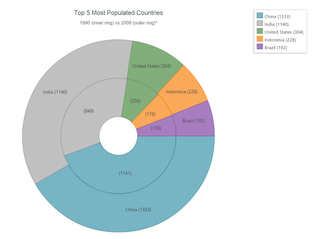
The igDoughnutChart displays data similar to a pie chart and can display multiple sets of data around a common center. With the Ignite UI Doughnut chart you can easily display multiple rings at the same time, and are capable of binding the same or different collections. Usually, this chart is used to show categorical statistics expressed in percentages. It exposes various options, allowing you to customize its appearance and the way your data is visualized. It allows for proportionally illustrating the occurrences of a variable. The inner radius of the control is configurable, and the Doughnut Chart’s series provides a built-in support for selecting and exploding its slices.


This blog will cover several main settings used to configure and customize the igDoughnutChart components:

  • Configure Basic Settings
  • Configure Legend
  • Bind to JSON
  • Labels and Tooltips
  • Styling and Theming


Before you start:

To add igDoughnutChart to your web application, you need the required JavaScript and CSS files referenced on the HTML page.


<link href="css/themes/infragistics/infragistics.theme.css" rel="stylesheet" /><link href="css/structure/infragistics.css" rel="stylesheet" /><script src="js/modernizr.min.js"></script><script src="js/jquery.min.js"></script><script src="js/jquery-ui.min.js"></script><!-- Ignite UI Required Combined JavaScript Files --><script src="js/infragistics.core.js"></script><script src="js/infragistics.dv.js"></script>

If you don’t want to host source scripts and prefer to use a CDN you need to add these resources:


<script src="http://igniteui.com/js/modernizr.min.js"></script><script src="http://code.jquery.com/jquery-1.9.1.min.js"></script><script src="http://code.jquery.com/ui/1.10.3/jquery-ui.min.js"></script><script src="http://cdn-na.infragistics.com/igniteui/latest/js/infragistics.core.js"></script><script src="http://cdn-na.infragistics.com/igniteui/latest/js/infragistics.dv.js"></script><link href="http://cdn-na.infragistics.com/igniteui/latest/css/themes/infragistics/infragistics.theme.css" rel="stylesheet"></link><link href="http://cdn-na.infragistics.com/igniteui/latest/css/structure/infragistics.css" rel="stylesheet"></link>


Adding Ignite UI Doughnut Chart to HTML page:

To do this, you'll need to add a div element in the body of your HTML page, which is used to create the Doughnut Chart:


<div style="text-align: center; width: 100%; font:16px Arial, Helvetica, sans-serif;">1990 Population</div><div style="text-align: center; width: 100%; margin: 10px 0; font:12px Arial, Helvetica, sans-serif;">Top 5 largest countries by population (in millions)</div><!-- Target element for the igDoughnutChart --><div id="chart"></div>


Next you need to instantiate the igDoughnutChart control.


$("#chart").igDoughnutChart({
    width: "100%",
    height: "550px",
    series:
    [{
        name: "Pop1990",
        labelMemberPath: "CountryName",
        valueMemberPath: "Pop1990",
        dataSource: data,
        labelsPosition: "bestFit",
        formatLabel: function (context) {
            return context.itemLabel + " (" + context.item.Pop1990 + ")";
        }
    }]
});


The picture below demonstrates generated Doughnut Chart:

If you need to add the Ignite UI Doughnut Chart control to your ASP.NET MVP project with ASPX views, you'll need to follow these steps:

1. Import the Infragistics.Web.Mvc namespace


2. Add references to the combined files for all data visualization controls

<link href="<%=Url.Content("~/Scripts/css/structure/modules/infragistics.ui.chart.css")%>" rel="stylesheet"></link><link href="<%=Url.Content("~/Scripts/css/themes/infragistics/infragistics.theme.css")%>" rel="stylesheet"></link><script src="<%=Url.Content("~/Scripts/jquery.min.js")%>" type="text/javascript"></script><script src="<%=Url.Content("~/Scripts/jquery-ui.min.js")%>" type="text/javascript"></script><script src="<%=Url.Content("~/Scripts/js/infragistics.core.js")%>" type="text/javascript"></script><script src="<%=Url.Content("~/Scripts/js/infragistics.dv.js")%>" type="text/javascript"></script>


3. Instantiate the igDoughnutChart control in the ASPX view

<body><%= Html.Infragistics().DoughnutChart()
                    .Width("300px")
                    .Height("300px")
                    .Series(s =>
                    {
                        s.Ring("flatSeries", Model.AsQueryable())
                            .ValueMemberPath(o => o.Index);
                        })
                     .Render()%></body>


Configure Basic Settings

To configure your basic settings, your options can be divided in two groups: options for the whole doughnut and options for the series. The first group contains options that control the behavior of all of the slices, while the second group allows you to choose the slices color, labels, style and etc.

Doughnut options:

There are two basic options that corresponds to the slices actions. The allowSliceExplosion option makes the slices pop out of their places when a user clicks on them, and the allowSliceSelection option makes the slices selectable – that means when a user clicks on a particular slice it can change its style or trigger a client event. Both of those options are of Boolean type. You also need to initialize the sliceClick event if you want the mentioned properties to work.


sliceClick: function (e, ui) {
    ui.slice.isSelected = !ui.slice.isSelected;
    ui.slice.isExploded = !ui.slice.isExploded;
}


$("#chart").igDoughnutChart({
    width: "70%",
    height: "550px",
	allowSliceExplosion: true,
    allowSliceSelection: true,
    series:
    [{
        name: "Pop1990",
        labelMemberPath: "CountryName",
        valueMemberPath: "Pop1990",
        dataSource: data,
        labelsPosition: "bestFit",
        formatLabel: function (context) {
            return context.itemLabel + " (" + context.item.Pop1990 + ")";
        }
    }]
});

Since this is a doughnut chart. it has a “blank circle” for a center, but actually you can control the radius of that circle with the innerExtent option and make it as big or as small as you want - or get rid of it.

innerExtent: 20


Series options:

There are plenty of options by which you can manipulate the series. We are going to look at some of them, but you can find the whole list in the API documentation.  You can have as many slices for you chart as you need, but remember that it's useful to make each slice a different color to be able to distinguish their sizes easily. For that purpose you can use the brushes property. This defines the palette from which automatically assigned slice brushes are selected. The value provided should be an array of CSS color strings.

brushes: ["#B284BE", "#5D8AA8", "#C9FFE5", "#7CB9E8", "#F19CBB", "#FAEBD7"]


Configure Legend

You need to supply a dom element to use for the legend. This element defines the position of the legend.

// You need to supply a dom element to use for the legend (preferably a div element)
// Initialize
$("#chart").igDoughnutChart({
   series: 
      [{
          legend: $("selectorForLegendElement"),
          valueMemberPath: "Pop1990",
          name: "Pop1990",
          dataSource: data
      }]
});
// Get
var series = $("#chart").igDoughnutChart("option", "series");
series[0].legend;
// Set
$("#chart").igDoughnutChart("option", "series", [{ name: "Pop1990", legend: $("selectorForLegendElement") }]);

Bind to JSON

JSON, or JavaScript Object Notation, is an open standard format that uses human-readable text to transmit data objects consisting of attribute–value pairs. It is used primarily to transmit data between a server and web applications. One of the main cases is how to bind series to JSON arrays.

Let’s have a JSON array like this one shown below:

var data = [
	{ "CountryName": "China", "Pop1990": 1141 },
	{ "CountryName": "India", "Pop1990": 849 },
	{ "CountryName": "United States", "Pop1990": 250 },
	{ "CountryName": "Indonesia", "Pop1990": 178 },
	{ "CountryName": "Brazil", "Pop1990": 150 }
];

The dataSource option of the series is used to provide bindings:


$("#chart").igDoughnutChart({
	width: "100%",
	height: "550px",
	series:
	[{
		name: "Pop1990",
		labelMemberPath: "CountryName",
		valueMemberPath: "Pop1990",
		dataSource: data,
		labelsPosition: "bestFit",
		formatLabel: function (context) {
			return context.itemLabel + " (" + context.item.Pop1990 + ")";
		}
	}]
});

Labels and Tooltips

Labels and Tooltips in the igDoughnutChart series can be maintained via four properties:

  1. series.showTooltip
  2. series.tooltipTemplate
  3. series.labelMemberPath
  4. series.labelsPosition


The snippet below shows Ignite UI Donut Chart with two series where these properties are set from code:


$("#chart").igDoughnutChart({
	width: "100%",
	height: "550px",
	innerExtent: 20,
	series:
		[
			{
				name: "Budget",
				labelMemberPath: "Label",
				valueMemberPath: "Budget",
				dataSource: data,
				labelsPosition: "center",
				showTooltip: true,
				tooltipTemplate: "budgetTooltipTemplate"
			},
			{
				name: "DepartmentSize",
				labelMemberPath: "Label",
				valueMemberPath: "DepartmentSize",
				dataSource: data,
				labelsPosition: "outsideEnd",
				showTooltip: true,
				tooltipTemplate: "<div class='ui-chart-tooltip'><div class='bold'>${item.Label}</div><div>Department Size: <label class='bold'>${item.DepartmentSize}</label></div></div>"
			}
		]
});

Styling and Theming:

Your styling and theming customization gets or sets the style used when a slice is selected: selectedStyle option


// Initialize
$("#chart").igDoughnutChart({
    selectedStyle : { fill: "red", stroke: "blue", strokeThickness: 3, opacity: 1 }
});
// Get
var selectedStyle = $("#chart").igDoughnutChart("option", "selectedStyle");
// Set
$("#chart").igDoughnutChart("option", "selectedStyle", { 
fill: "red", stroke: "blue", strokeThickness: 3, opacity: 1 
});


The Ignite UI Doughnut Chart is not affected by Theming - it has no styling elements that could be set via themes.

An igDoughnutChart Example – all settings together

Now that we've gone through our options, let’s put everything into one example:

The sample below includes most of basic settings, selection and selection styling, series binding etc.


$(function () {

        var data = [
                        { "savings": 210, "Budget": 600, "Label": "George" },
                        { "savings": 100, "Budget": 400, "Label": "Sam" },
                        { "savings": 250, "Budget": 550, "Label": "John" },
                        { "savings": 29, "Budget": 300, "Label": "Mike" },
                        { "savings": 130, "Budget": 650, "Label": "David" },
                        { "savings": 54, "Budget": 200, "Label": "Sally" }
        ];

        var array = new Array();
        $("#chart").igDoughnutChart({
            width: "450px",
            height: "450px",
            innerExtent: 10,
            allowSliceExplosion: true,
            allowSliceSelection: true,
            sliceClick: function (e, ui) {
                ui.slice.isSelected = !ui.slice.isSelected;
                ui.slice.isExploded = !ui.slice.isExploded;
                array.push(ui.slice);
                $("#selectedItem").empty();
                for (var i = 0; i < array.length; i++) {
                    if (array[i].isSelected) {
                        $("#selectedItem").append("<p id=" + array[i].item.Label + ">" + array[i].item.Label + " recieves " + array[i].item.Budget + "$ and manage to saves " + array[i].item.savings + "$.</p>");
                    }
                    if (!(array[i].isSelected)){
                        $("#" + array[i].item.Label).remove();
                    }
                }
            },
            series:
                [
                    {
                        name: "Budget",
                        labelMemberPath: "Label",
                        valueMemberPath: "Budget",
                        dataSource: data,
                        labelsPosition: "bestFit",
                        brushes: ["#B284BE", "#5D8AA8", "#C9FFE5", "#7CB9E8", "#F19CBB", "#FAEBD7"],
                        legend: { element: "legend1" },
                        selectedStyle: { fill: "lightpink", stroke: "black" },
                        showTooltip: true,
                        tooltipTemplate: "budgetTooltipTemplate"
                    },
                    {
                        name: "savings",
                        labelMemberPath: "Label",
                        valueMemberPath: "savings",
                        dataSource: data,
                        labelsPosition: "bestFit",
                        brushes: ["#7FFFD4", "#FF91AF", "#BCD4E6", "#FAE7B5", "#A2A2D0", "#FBEC5D"],
                        selectedStyle: { fill: "#FF6A6F", stroke: "black" },
                        showTooltip: true,
                        tooltipTemplate: "savings Template",
                        legend: { element: "legend2" }
                    }
                ]

        });

    });


The Infragistics jQuery Doughnut Chart supports a lot of other features which can help you customize it according to your needs. You can find a detailed information about the control and its features and how to configure its separate parts in the API documentation as we as the online help documentation.

To play around with the Doughnut Chart on your own, be sure to get Infragistics Ultimate and see the chart in action in our latest sample application by clicking the banner below!

How to deal with multiple data on the data chart (how to create dashboards)

$
0
0

Ignite UI is the Infragistics jQuery & HTML5 based framework. With Ignite UI, developers can create next generation, browser based, touch-enabled tablet, mobile & desktop experiences. In this article we will look at how we create dashboards applications using this data visualization components framework. The samples will be mainly focused on Ignite UI Data Chart (igDataChart) and different options to use different data source ( big amount of data,  public OData sources ) and how to arrange these charts in your layout. .

In the near future cloud systems will have an increasing impact on our lives. Developers will focus more on building applications in the cloud.

Let's start with how we can create WEB application with charts and and different data sources:


This article  will cover several main points related to how to create web dashboards using Ignite UI Data Chart (igDataChart) component:

  • Prerequisites
  • Composite charts
  • Create composite layouts
  • Using Ignite UI Data Chart with high volume of data
  • Using Infragistics jQuery chart with live OData services
  • Composite dashboards with different controls ( igDataChart, igGrid, igMap )
  • Demo ( different Ignite UI Charts )


  • Prerequisites:


To add igDataChart to your web application, you need the required JavaScript and CSS files referenced on the HTML page.

The links below show the required resources:


Composite charts:

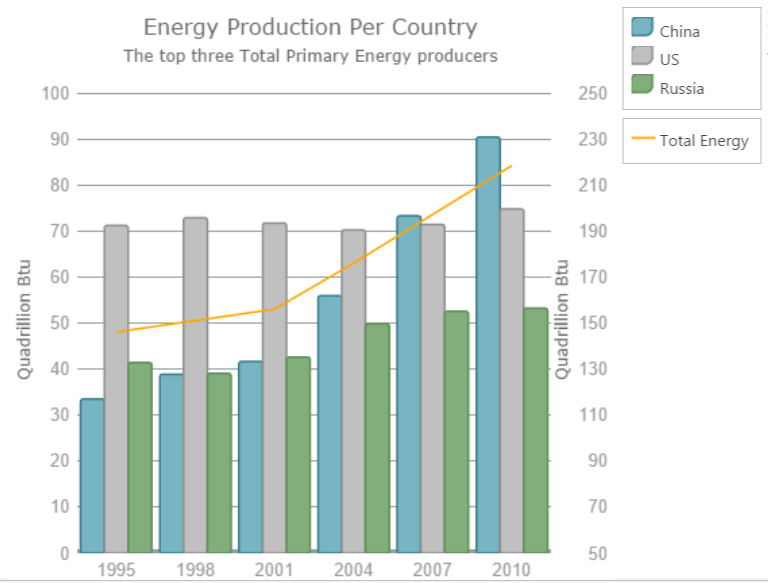
Composite charts plot at least two data series that either use different axis ranges or are visualized by two different types of graphs. That means that, for example, one function spans between 1 and 100, and the other between 5 and 500, or even has a logarithmic scale, or one function is depicted by columns and the other by line.


$("#chart").igDataChart({
	dataSource: everyThreeYears,
	width: "450px",
	height: "450px",
	title: "Energy Production Per Country",
	subtitle: "The top three Total Primary Energy producers",
	horizontalZoomable: true,
	verticalZoomable: true,
	axes: [{
		type: "categoryX",
		name: "xAxis",
		label: "Year",
		strokeThickness: 5,
		title: "Year"
	}, {
		type: "numericY",
		name: "prodPower",
		minimumValue: 0,
		maximumValue: 100,
		strokeThickness: 5,
		title: "Quadrillion Btu"
	}, {
		type: "numericY",
		name: "totalPower",
		minimumValue: 50,
		maximumValue: 250,
		labelLocation: "outsideRight",
		title: "Quadrillion Btu",
	}],
	series: [{
		type: "column",
		isHighlightingEnabled: true,
		isTransitionInEnabled: true,
		name: "China",
		title: "China",
		xAxis: "xAxis",
		yAxis: "prodPower",
		valueMemberPath: "China",
		showTooltip: true,
		tooltipTemplate: "tooltipChina",
		legend: { element: "legend" }
	}, {
		type: "column",
		isHighlightingEnabled: true,
		isTransitionInEnabled: true,
		name: "UnitedStates",
		title: "US",
		xAxis: "xAxis",
		yAxis: "prodPower",
		valueMemberPath: "UnitedStates",
		showTooltip: true,
		tooltipTemplate: "tooltipUS",
		legend: { element: "legend" }
	}, {
		type: "column",
		isHighlightingEnabled: true,
		isTransitionInEnabled: true,
		name: "Russia",
		title: "Russia",
		xAxis: "xAxis",
		yAxis: "prodPower",
		valueMemberPath: "Russia",
		showTooltip: true,
		tooltipTemplate: "tooltipRussia",
		legend: { element: "legend" }
	}, {
		type: "line",
		isHighlightingEnabled: true,
		isTransitionInEnabled: true,
		name: "Total",
		title: "Total Energy",
		xAxis: "xAxis",
		yAxis: "totalPower",
		valueMemberPath: "Total",
		brush: "Orange",
		showTooltip: true,
		tooltipTemplate: "tooltipTotal",
		legend: { element: "legend2" }
	}],
	leftMargin: 5,
	topMargin: 15
});


You can see the final chart, based on the code above:


    Create composite layouts

      One of the most important when you are going to create dashboards is how to arrange your components in the page layout.

      The last two sections of this article demonstrate several layouts.


      Ignite UI Data Chart by default uses div element:


      It is also possible to use different div from your DOM for other igDataChart elements like legend:

      Using Ignite UI Data Chart with  high volume of data

      igDataChart works properly with big amount elements in the series.


      You can find more information in the Ignute UI website


      The image below demonstrates line series with high volume data:


      Using Infragistics jQuery chart with live OData services

      You can bind to the OData services, that returns data in json format , but often you need to maintain this data before to bind it to the igDataChart.

      The code below demonstrates how to manage Northwind data from www.odata.orgwebsite.

      Infragistics jQuery Chart expects a collection for its series. In this case collection is under the value option:

       var horthwndAPI = "http://services.odata.org/V4/Northwind/Northwind.svc/Products";
      
      $.getJSON(horthwndAPI, function (json) {
      
      	// Set the variables from the results array
      	var datavalues = json.value;
      	
      	$("#chart").igDataChart({
      		width: "100%",
      		height: "220px",
      		dataSource: datavalues,
      		//dataSource: "http://services.odata.org/V4/Northwind/Northwind.svc/Products",
      		axes: [{ name: "xAxis", type: "categoryX", label: "OrderID", labelVisibility: "visible" },
      				{ name: "yAxis", type: "numericY", labelVisibility: "visible" }],
      		series: [
      			{
      				name: "series",
      				title: "Product",
      				type: "line",
      				xAxis: "xAxis",
      				yAxis: "yAxis",
      				valueMemberPath: "UnitPrice", trendLineThickness: 6, thickness: 4,
      				trendLineBrush: "cyan",
      				transitionDuration: 1500,
      				trendLineType: "exponentialAverage"
      			}],
      		horizontalZoomable: true,
      		verticalZoomable: true,
      		windowResponse: "immediate",
      		overviewPlusDetailPaneVisibility: "visible"
      	});	
      
      });


      Composite dashboards with different controls (igDataChart, igGrid, igMap)


      Often you need to arrange different components in your dashboard and to let them to interact:
      for example if you select a record from the igGrid, to update your data for igDataChart and igMap,


      First you need to consider how to arrange components in the page layout:


      Highlight Color:

      Then you need to implement interaction between components:

      The Ignite UI Data Chart datasource is updated based of the selected record in igGrid:


      $("#chart").igDataChart({
      	width: "100%",
      	height: "220px",
      	dataSource: "/Home2/Orders",
      	axes: [{ name: "xAxis", type: "categoryX", label: "OrderID", labelVisibility: "visible" },
      			{ name: "yAxis", type: "numericY", labelVisibility: "visible"}],
      	series: [
      		{ name: "series",
      			title: "Order Freight Series",
      			type: "line",
      			xAxis: "xAxis",
      			yAxis: "yAxis",
      			valueMemberPath: "Freight", trendLineThickness: 6, thickness: 4,
      			trendLineBrush: "cyan",
      			transitionDuration: 1500,
      			trendLineType: "exponentialAverage"
      		}],
      	horizontalZoomable: true,
      	verticalZoomable: true,
      	windowResponse: "immediate",
      	overviewPlusDetailPaneVisibility: "visible"
      });
      
       $("#chart").igDataChart({
      	 dataSource: "/Home2/Orders?userID=" + args.row.element[0].cells[0].textContent
       });


      The full JavaScript source is available below:


      $("#map").igMap({
      	width: "100%",
      	panModifier: "control",
      	horizontalZoomable: true,
      	verticalZoomable: true,
      	windowResponse: "immediate",
      	overviewPlusDetailPaneVisibility: "visible",
      	windowRect: 
      	  {
      		  left: 0,
      		  top: 0,
      		  width: 0.5,
      		  height: 0.5
      	  },
      	seriesMouseLeftButtonUp: function (ui, args) {
      		var tets = args;
      	}
      });
      
      $("#chart").igDataChart({
      	width: "100%",
      	height: "220px",
      	dataSource: "/Home2/Orders",
      	axes: [{ name: "xAxis", type: "categoryX", label: "OrderID", labelVisibility: "visible" },
      			{ name: "yAxis", type: "numericY", labelVisibility: "visible"}],
      	series: [
      		{ name: "series",
      			title: "Order Freight Series",
      			type: "line",
      			xAxis: "xAxis",
      			yAxis: "yAxis",
      			valueMemberPath: "Freight", trendLineThickness: 6, thickness: 4,
      			trendLineBrush: "cyan",
      			transitionDuration: 1500,
      			trendLineType: "exponentialAverage"
      		}],
      	horizontalZoomable: true,
      	verticalZoomable: true,
      	windowResponse: "immediate",
      	overviewPlusDetailPaneVisibility: "visible"
      });
      
      $('#grid').igGrid({
      	virtualization: false, height: 280, width: "100%",
      	dataSource: "/Home2/Customers",
      	autoGenerateColumns: false,
      	columns: [
      		{ headerText: "Customer ID", key: "CustomerID", width: "120px", dataType: "string" },
      		{ headerText: "Country", key: "Country", width: "150px", dataType: "string" },
      		{ headerText: "City", key: "City", dataType: "string" },
      		{ headerText: "Contact", key: "ContactName", dataType: "string" },
      		{headerText: "Phone", key: "Phone", dataType: "string" }
      	],
      	features: [
      
      	 {
      		 name: 'Selection',
      		 mode: 'row',
      		 multipleSelection: false,
      		 rowSelectionChanged: function (ui, args) {
      			 $("#chart").igDataChart({
      				 dataSource: "/Home2/Orders?userID=" + args.row.element[0].cells[0].textContent
      			 });
      
      			 selected = args.row.element[0].cells[0].textContent; //keep track of selected user
      			 var countryUrl = "/Home2/CountryByName?countryName=" + args.row.element[0].cells[1].textContent;
      
      			$.getJSON(countryUrl,
      			   function (json, text) {
      				   $.each(json, function (index, value) {
      					   var country = value;
      					   var extend = country["Extend"];                                   
      
      					   var shapeData = country["ShapeData"];
      
      					   selectedColor = $('#color1')[0].value;
      
      					   var zoom = $("#map").igMap("getZoomFromGeographic", extend);
      					   $("#map").igMap("option", "windowRect", zoom);
      					   $("#map").igMap("option", "series", [{
      						   name: "series1",
      						   type: "geographicShape",
      						   markerType: "none",
      						   dataSource: shapeData,
      						   shapeMemberPath: "Points",
      						   shapeStyle: {
      							   fill: selectedColor,
      							   stroke: "black",
      							   thickness: 8.0
      						   }
      
      					   }]
      					 );
      					 
      					   var center = country["Center"];
      					   var name, lat, lon, centerData;
      
      					   name = country["CountryName"];
      
      					   lat = parseFloat(center.y);
      					   lon = parseFloat(center.x);
      
      					   centerData = [{ Name: name, Latitude: lat, Longitude: lon }];
      
      					   $("#map").igMap("option", "series", [{
      						   name: "Countries", 
      						   type: "geographicSymbol",
      						   longitudeMemberPath: "Longitude",
      						   latitudeMemberPath: "Latitude",
      
      						   /*
      						  The provided object should have properties called render and optionally measure.
      						  These are functions which will be called that will be called to handle the user specified custom rendering.
      						  */
      						   markerTemplate: {
      							   render: function (renderInfo) {
      								   var ctx = renderInfo.context; //2d canvas context
      								   var x = renderInfo.xPosition;
      								   var y = renderInfo.yPosition;
      
      								   if (renderInfo.isHitTestRender) {
      									   //  This is called for tooltip hit test only
      									   //  Rough marker rectangle size calculation
      									   ctx.fillStyle = "yellow";
      									   ctx.fillRect(x, y, renderInfo.availableWidth, renderInfo.availableHeight);
      								   } else {
      									   //actual marker drawing is here:
      									   var markerData = renderInfo.data;
      									   var name = markerData.item()["Name"];
      									   //set font or measure will be for the default one
      									   ctx.font = '10pt Segoe UI';
      									   var textWidth = ctx.measureText(name).width;
      
      									   //Move the path point to the desired coordinates:
      									   ctx.moveTo(x, y);
      									   //Draw lines:
      									   ctx.beginPath();
      									   ctx.lineTo(x - (textWidth / 2) - 5, y + 5);
      									   ctx.lineTo(x - (textWidth / 2) - 5, y + 40); // 35width rect.
      									   ctx.lineTo(x + (textWidth / 2) + 5, y + 40); // full textWidth line plus 5 margin
      									   ctx.lineTo(x + (textWidth / 2) + 5, y + 5); // 35 up
      									   ctx.lineTo(x, y);
      									   //finish the shape
      									   ctx.closePath();
      									   ctx.fillStyle = "rgba(78,183,226,0.7)";
      									   ctx.fill();
      									   ctx.lineWidth = 0.5;
      									   ctx.strokeStyle = "#185170";
      									   ctx.stroke();
      									   //add a point at the start
      									   ctx.beginPath();
      									   ctx.fillStyle = "black";
      									   ctx.arc(x, y, 1.5, 0, 2 * Math.PI, true);
      									   ctx.fill();
      
      									   //  Draw text
      									   ctx.textBaseline = "top";
      									   ctx.fillStyle = "black";
      									   ctx.textAlign = 'center';
      									   ctx.fillText(selected, x, y + 8);
      									   ctx.fillText(name, x, y + 20);
      								   }
      							   }
      						   },
      
      						   dataSource: centerData
      					   }]
      					); //MM2
      
      				   });
      			 });
      
      		 }
      	 }
      	,
      
      	{
      		name: 'Sorting',
      		type: "remote"
      	},
      	{
      		name: 'Paging',
      		type: "local",
      		pageSize: 10,
      		//pageSizeDropDownLocation: "inpager",
      		pageCountLimit : 1
      	}]
      	,
      	rendered: function (ui, args) {
      		//set up on-load selection 
      		$('#grid').igGridSelection("selectRow", 0);
      		//another way to get cell value independant of event parameters
      		var id = $('#grid').igGrid("getCellValue", 0, "CustomerID");
      		$("#chart").igDataChart({
      			dataSource: "/Home2/Orders?userID=" + id
      		});
      
      
      	}
      });


      The final result is like the on the picture below:


      If can see the live demo, hosted in Microsoft Azure here:


        Demo (different Ignite UI Charts)


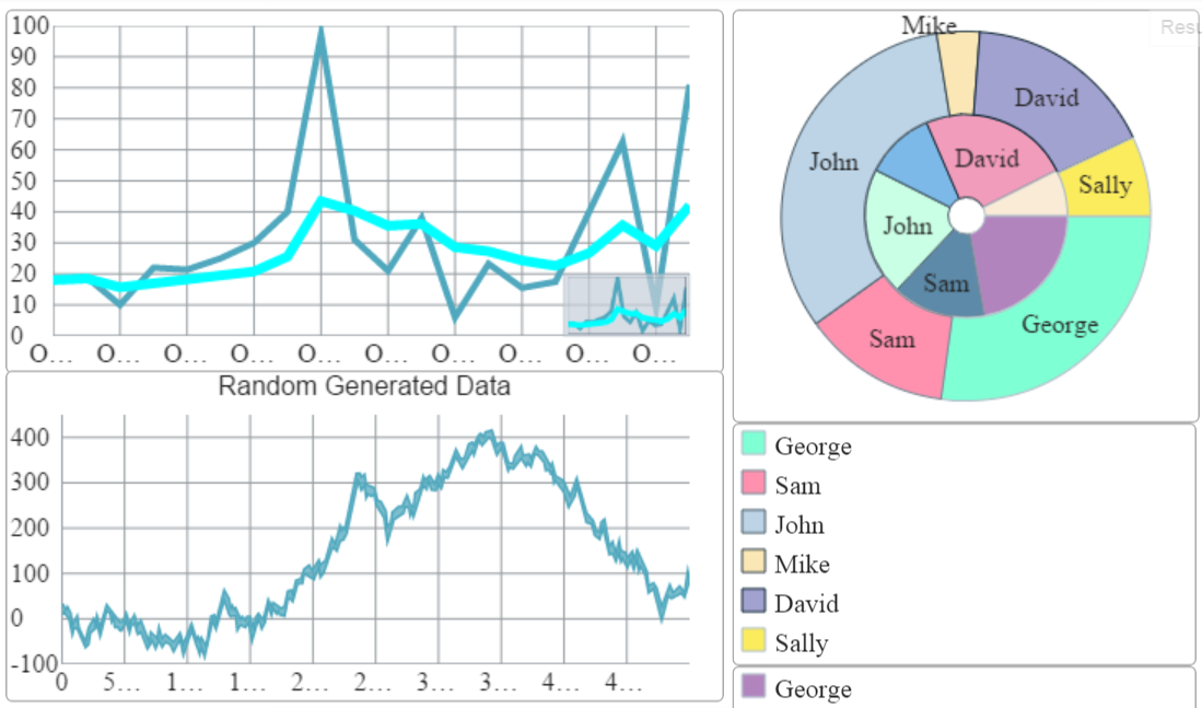
          Ignite UI dashboard demo includes several igDataChart instances and one igDoughnutChart widget.


          The Doughnut Chart , mentioned in my previous post: “How to Customize Ignite UI Doughnut Chart Control” is also added in the right side of the layout:


          Ignite UI Doughnut Chart supports ( in the same way like igDataChart ) multiple data sources that can be set to each series.

          The snippet demonstrates how you can set data:


          series:
          	[
          		{
          			name: "Budget",
          			labelMemberPath: "Label",
          			valueMemberPath: "Budget",
          			dataSource: data2,
          			labelsPosition: "bestFit",
          			brushes: ["#B284BE", "#5D8AA8", "#C9FFE5", "#7CB9E8", "#F19CBB", "#FAEBD7"],
          			legend: { element: "legend1" },
          			selectedStyle: { fill: "lightpink", stroke: "black" },
          			showTooltip: true,
          			tooltipTemplate: "budgetTooltipTemplate"
          		}
          	]


          You can see the whole code for igDoughnutChart chart below:


          $(function () {
          
                  var data = [
                                  { "savings": 210, "Budget": 600, "Label": "George" },
                                  { "savings": 100, "Budget": 400, "Label": "Sam" },
                                  { "savings": 250, "Budget": 550, "Label": "John" },
                                  { "savings": 29, "Budget": 300, "Label": "Mike" },
                                  { "savings": 130, "Budget": 650, "Label": "David" },
                                  { "savings": 54, "Budget": 200, "Label": "Sally" }
                  ];
          
                  var array = new Array();
                  $("#chart").igDoughnutChart({
                      width: "450px",
                      height: "450px",
                      innerExtent: 10,
                      allowSliceExplosion: true,
                      allowSliceSelection: true,
                      sliceClick: function (e, ui) {
                          ui.slice.isSelected = !ui.slice.isSelected;
                          ui.slice.isExploded = !ui.slice.isExploded;
                          array.push(ui.slice);
                          $("#selectedItem").empty();
                          for (var i = 0; i < array.length; i++) {
                              if (array[i].isSelected) {
                                  $("#selectedItem").append("

          " + array[i].item.Label + " recieves " + array[i].item.Budget + "$ and manage to saves " + array[i].item.savings + "$.

          ");
                              }
                              if (!(array[i].isSelected)){
                                  $("#" + array[i].item.Label).remove();
                              }
                          }
                      },
                      series:
                          [
                              {
                                  name: "Budget",
                                  labelMemberPath: "Label",
                                  valueMemberPath: "Budget",
                                  dataSource: data,
                                  labelsPosition: "bestFit",
                                  brushes: ["#B284BE", "#5D8AA8", "#C9FFE5", "#7CB9E8", "#F19CBB", "#FAEBD7"],
                                  legend: { element: "legend1" },
                                  selectedStyle: { fill: "lightpink", stroke: "black" },
                                  showTooltip: true,
                                  tooltipTemplate: "budgetTooltipTemplate"
                              },
                              {
                                  name: "savings",
                                  labelMemberPath: "Label",
                                  valueMemberPath: "savings",
                                  dataSource: data,
                                  labelsPosition: "bestFit",
                                  brushes: ["#7FFFD4", "#FF91AF", "#BCD4E6", "#FAE7B5", "#A2A2D0", "#FBEC5D"],
                                  selectedStyle: { fill: "#FF6A6F", stroke: "black" },
                                  showTooltip: true,
                                  tooltipTemplate: "savings Template",
                                  legend: { element: "legend2" }
                              }
                          ]
          
                  });
          
              });


          It looks in this way:


          You can see the whole JavaScript source code below:


          $(function () {
          	vara currData, currDataSource, doGeneration, startTime = null;
          			var sliderValue = 50000;
          
          			function doGeneration() {
          				var num = sliderValue, data = [], curr = 10;
          
          				for (var i = 0; i < num; i++) {
          					if (Math.random() > .5) {
          						curr += Math.random() * 2.0;
          					} else {
          						curr -= Math.random() * 2.0;
          					}
          					var val1 = Math.round(curr * 1000.0) / 1000.0;
          					data[i] = { Label: i.toString(), Value: val1 };
          				}
          				return data;
          			}
          
          
          	currData  = doGeneration();
          		
          	var data2 = [
          							{ "savings": 210, "Budget": 600, "Label": "George" },
          							{ "savings": 100, "Budget": 400, "Label": "Sam" },
          							{ "savings": 250, "Budget": 550, "Label": "John" },
          							{ "savings": 29, "Budget": 300, "Label": "Mike" },
          							{ "savings": 130, "Budget": 650, "Label": "David" },
          							{ "savings": 54, "Budget": 200, "Label": "Sally" }
          			];
          		var array = new Array();
          
          	var array = new Array();
          	$("#doughnutChart").igDoughnutChart({
          		width: "100%",
          		height: "250px",
          		innerExtent: 10,
          		allowSliceExplosion: true,
          		allowSliceSelection: true,
          		sliceClick: function (e, ui) {
          			ui.slice.isSelected = !ui.slice.isSelected;
          			ui.slice.isExploded = !ui.slice.isExploded;
          			array.push(ui.slice);
          			$("#selectedItem").empty();
          			for (var i = 0; i < array.length; i++) {
          				if (array[i].isSelected) {
          					$("#selectedItem").append("

          " + array[i].item.Label + " recieves " + array[i].item.Budget + "$ and manage to saves " + array[i].item.savings + "$.

          ");
          				}
          				if (!(array[i].isSelected)){
          					$("#" + array[i].item.Label).remove();
          				}
          			}
          		},
          		series:
          			[
          				{
          					name: "Budget",
          					labelMemberPath: "Label",
          					valueMemberPath: "Budget",
          					dataSource: data2,
          					labelsPosition: "bestFit",
          					brushes: ["#B284BE", "#5D8AA8", "#C9FFE5", "#7CB9E8", "#F19CBB", "#FAEBD7"],
          					legend: { element: "legend1" },
          					selectedStyle: { fill: "lightpink", stroke: "black" },
          					showTooltip: true,
          					tooltipTemplate: "budgetTooltipTemplate"
          				},
          				{
          					name: "savings",
          					labelMemberPath: "Label",
          					valueMemberPath: "savings",
          					dataSource: data2,
          					labelsPosition: "bestFit",
          					brushes: ["#7FFFD4", "#FF91AF", "#BCD4E6", "#FAE7B5", "#A2A2D0", "#FBEC5D"],
          					selectedStyle: { fill: "#FF6A6F", stroke: "black" },
          					showTooltip: true,
          					tooltipTemplate: "savings Template",
          					legend: { element: "legend2" }
          				}
          			]
          
          	});  
          		
          
          	$("#datachart").igDataChart({
          					width: "100%",
          					height: "200px",
          					title: "Random Generated Data",
          					dataSource: currData,
          					axes: [{
          						name: "xAxis",
          						type: "categoryX",
          						label: "Label"
          					}, {
          						name: "yAxis",
          						type: "numericY"
          					}],
          					series: [{
          						name: "series1",
          						title: "Test Series",
          						type: "line",
          						xAxis: "xAxis",
          						yAxis: "yAxis",
          						valueMemberPath: "Value",
          						showTooltip: true,
          						isTransitionInEnabled: true,
          						isHighlightingEnabled: true,
          						tooltipTemplate: "tooltipTemplate"
          					}],
          					horizontalZoomable: true,
          					verticalZoomable: true,
          					windowResponse: "immediate"
          				});
          	 var horthwndAPI = "http://services.odata.org/V4/Northwind/Northwind.svc/Products";
          
          	$.getJSON(horthwndAPI, function (json) {
          
          		// Set the variables from the results array
          		var datavalues = json.value;
          		
          		$("#chart").igDataChart({
          			width: "100%",
          			height: "220px",
          			dataSource: datavalues,
          			//dataSource: "http://services.odata.org/V4/Northwind/Northwind.svc/Products",
          			axes: [{ name: "xAxis", type: "categoryX", label: "OrderID", labelVisibility: "visible" },
          					{ name: "yAxis", type: "numericY", labelVisibility: "visible" }],
          			series: [
          				{
          					name: "series",
          					title: "Product",
          					type: "line",
          					xAxis: "xAxis",
          					yAxis: "yAxis",
          					valueMemberPath: "UnitPrice", trendLineThickness: 6, thickness: 4,
          					trendLineBrush: "cyan",
          					transitionDuration: 1500,
          					trendLineType: "exponentialAverage"
          				}],
          			horizontalZoomable: true,
          			verticalZoomable: true,
          			windowResponse: "immediate",
          			overviewPlusDetailPaneVisibility: "visible"
          		});	
          
          	});
              
          });


          The dashboard looks like this one below:


          The whole dashboard example you can find in JSFIDDLE here:


          The Infragistics jQuery Data Visualization controls offer  a wide range of options to create almost any dashboard that you need. In this post we use Ignite UI Data Chart and Doughnut Chart, but you can see sample how to use any of data visualization components on the Ignite UI website.  You can find a detailed information about the control and its features and how to configure its separate parts in the API documentation as we as the online help documentation.

          To play around with the Ignite UI dashboards on your own, be sure to get Infragistics Ultimate and see the chart in action in our latest sample application by clicking the banner below!

          Common Business Scenarios with Infragistics UltraDataChart

          $
          0
          0

          Infragistics UltraDataChart Control has been engineered to dramatically simplify the way in which you visually present information to your end-users. Optimized for both performance and flexibility, the WinForms DataChart is a highly customizable control library which can be leveraged in a nearly endless number of business scenarios, be it real-time charting or analysis of multi-dimensional data.

          The updated Windows Forms Data Chart is fast, fully-featured, and arguably the most modern Windows Forms chart on the market. Smoothly animate data over time using the innovative Motion Framework, create composite charts, and use multiple series, featuring a range of series that include Line, Stacked Line, Stacked Area, Stacked 100-Bar, Column, Waterfall, Candlestick and more.


          Using the UltraDataChart

          The UltraDataChart offers powerful ways to interact with data, such as zooming, trendlines and chart synchronization. In addition to all the types supported by the XamChart, UltraDataChart supports polar and radial series types. It enables developers to not only visualize the data, but also enable users to interact with it. The UltraDataChart only supports 2D chart types, and chart types which do not require an axis, such as a pie, and funnel will be implemented by separate controls like the Pie Chart, Funnel Chart etc.


          How do you use the UltraDataChart

          • Declare the axes (the UltraDataChart supports string (CategoryXAxis, CategoryYAxis, CategoryAngleAxis), numeric (NumericXAxis, NumericYAxis, NumericRadiusAxis, NumericAngleAxis), and date (CategoryDateTimeAxis). In this case we’d like to have dates along the X axis, and numeric values along the Y axis, so we’re using the CategoryDateTimeXAxis and the NumericYAxis.
          • Declare the series, referencing the two axes
          • Declare tooltips


          Infragistics Windows Forms UltraDataChart High Performance Scenarios

          When you’re dealing with real-time or large volumes of data, the three most critical factors for the user experience of your application are performance, performance and…performance! Customers are often interested in the performance of the UltraDataChart (the fast chart component featuring zooming and panning in Infragistics Windows Forms controls). Rather than just say “well, they’re capable of handling millisecond-based updates without noticeable delay in rendering, and are in use at mission-critical applications handling real-time and high-volume data", let's see the chart in action in a few different high performance scenarios!


          UltraDataChart real-time data scenario

          This scenario shows the UltraDataChart bound to a real-time data feed. You can start or stop the real-time data feed by clicking the Toggle Live Data button, and can modify the speed of data update and the amount of data displayed in the chart control using the two sliders above. You can see the time it takes to layout the points in the chart in the label above it, just so you can get an idea of how fast the UltraDataChart really is.

          UltraDataChart-Scenarios-Pic01[1]

          The source code is available below:

           1:using System;
           2:using System.Collections;
           3:using System.Collections.Generic;
           4:using System.Collections.ObjectModel;
           5:using System.Drawing;
           6:using System.Globalization;
           7:using System.Linq;
           8:using System.Windows.Forms;
           9:using Infragistics.Controls.Charts;
           10:using Infragistics.Extension.Models;
           11:using Infragistics.Extension.Services;
           12:using Infragistics.Win.DataVisualization;
           13:using HorizontalAlignment = Infragistics.Portable.Components.UI.HorizontalAlignment;
           14:  
           15:namespace Infragistics.Samples
           16: {
           17:publicpartialclass SampleForm : Form
           18:     {
           19:#region Default constructor
           20:public SampleForm()
           21:         {
           22:             InitializeComponent();
           23:             Load += OnFormLoaded;
           24:             btnReset.Click += btnReset_Click;
           25:         }
           26:#endregion// Default constructor
           27:  
           28:#region Protected Members
           29:protected DataStockService StockService;
           30:protected UltraDataChart PriceChart;
           31:protected UltraDataChart VolumeChart;
           32:#endregion// Protected Members
           33:  
           34:#region Events
           35:  
           36:#region OnFormLoaded
           37:privatevoid OnFormLoaded(object sender, EventArgs e)
           38:         {
           39:             InitializeForm();
           40:  
           41:             StockService = new DataStockService();
           42:             StockService.DataStockReceived += StockService_DataStockReceived;
           43:  
           44:             var data = StockService.DataPoints;
           45:  
           46:             PriceChart = CreatePriceChart(data);
           47:             VolumeChart = CreateVolumeChart(data);
           48:  
           49:             var table = new TableLayoutPanel
           50:             {
           51:                 Dock = DockStyle.Fill,
           52:                 AutoSizeMode = AutoSizeMode.GrowOnly,
           53:                 GrowStyle = TableLayoutPanelGrowStyle.AddRows
           54:             };
           55:             table.Controls.Add(PriceChart, 0, 1);
           56:             table.Controls.Add(VolumeChart, 0, 2);
           57:  
           58:             PanelCenter.ClientArea.Controls.Add(table);
           59:         }
           60:#endregion// OnFormLoaded
           61:  
           62:#region btnReset_Click
           63:void btnReset_Click(object sender, EventArgs e)
           64:         {
           65:             PriceChart.ResetZoom();
           66:             VolumeChart.ResetZoom();
           67:         }
           68:#endregion// btnReset_Click
           69:  
           70:#region StockService_DataStockReceived
           71:void StockService_DataStockReceived(object sender, DataStockReceivedEventArgs e)
           72:         {
           73://var data = StockService.DataPoints;
           74:             var data = new DataStockList();
           75:             data.AddRange(StockService.DataPoints);
           76:  
           77:             UpdatePriceChart(data);
           78:             UpdateVolumeChart(data);
           79:         }
           80:#endregion// StockService_DataStockReceived
           81:  
           82:#region OnAxisXFormatLabel
           83:string OnAxisXFormatLabel(AxisLabelInfo info)
           84:         {
           85:             var item = info.Item as DataStockPoint;
           86:if (item != null) return item.Date.ToString("yyyy/MM/dd");
           87:  
           88:return info.ToString();
           89:         }
           90:#endregion// OnAxisXFormatLabel
           91:  
           92:#region OnAxisYFormatLabel
           93:string OnAxisYFormatLabel(AxisLabelInfo info)
           94:         {
           95:             var axisValue = info.Value;
           96:if (axisValue < 1000)
           97:returnstring.Format("{0:0.#}", axisValue);
           98:if (axisValue < 1000000)
           99:returnstring.Format("{0:#,0,.#} K", axisValue);
           100:if (axisValue < 1000000000)
           101:returnstring.Format("{0:#,0,,.#} M", axisValue);
           102:if (axisValue < 1000000000000)
           103:returnstring.Format("{0:#,0,,,.#} B", axisValue);
           104:  
           105:return axisValue.ToString();
           106:         }
           107:#endregion// OnAxisYFormatLabel
           108:  
           109:#endregion
           110:  
           111:#region Methods
           112:  
           113:#region InitializeForm
           114:publicvoid InitializeForm()
           115:         {
           116:             speedEditor.ValueChanged += speedEditor_ValueChanged;
           117:             btnStartService.Click += btnStartService_Click;
           118:  
           119:// Add the form's caption as the sample name
           120:             ultraFormManager1.FormStyleSettings.Caption = Properties.Resources.SampleTitle;
           121:  
           122:// Add button images on the form
           123:this.LoadImagesFor(SplitterTop, SplitterRight);
           124:  
           125:// Add the sample description
           126:             sampleInfo.SampleDescription = Resources.SamplesBrowser.SamplesBrowser.SampleDescription;
           127:             sampleInfo.SampleCodeCSharp = Properties.Resources.CS_CodeView;
           128:             sampleInfo.SampleCodeVBasic = Properties.Resources.VB_CodeView;
           129:             sampleInfo.SampleTitle = Properties.Resources.CodeViewerTitle;
           130:  
           131:             speedEditor.PropertyName = Properties.Resources.SpeedEditor_Label;
           132:         }
           133:#endregion// InitializeForm
           134:  
           135:#region CreatePriceChart
           136:public UltraDataChart CreatePriceChart(DataStockList data)
           137:         {
           138:             var chart = new UltraDataChart
           139:             {
           140:                 Width = 400,
           141:                 Height = 200,
           142:                 Dock = DockStyle.Fill,
           143:                 BackColor = System.Drawing.Color.White,
           144:                 PlotAreaBackground = new SolidColorBrush { Color = Color.White },
           145:                 Title = data.CompanyName,
           146:                 Subtitle = Properties.Resources.StockPrice,
           147:                 VerticalZoomable = true,
           148:                 HorizontalZoomable = true
           149:             };
           150:  
           151:             var xAxis = new CategoryXAxis
           152:             {
           153:                 Label = "Date",
           154:                 DataSource = data,
           155:                 LabelLocation = AxisLabelsLocation.OutsideBottom,
           156:                 UseClusteringMode = true
           157:             };
           158:             xAxis.FormatLabel += OnAxisXFormatLabel;
           159:  
           160:             var yAxis = new NumericYAxis
           161:             {
           162:                 LabelExtent = 50,
           163:                 LabelHorizontalAlignment = HorizontalAlignment.Right
           164:             };
           165:             yAxis.FormatLabel += OnAxisYFormatLabel;
           166:  
           167:             var yAxis2 = new NumericYAxis
           168:             {
           169:                 LabelExtent = 20,
           170:                 LabelLocation = AxisLabelsLocation.OutsideRight
           171:             };
           172:  
           173:             var series = new AreaSeries
           174:             {
           175:                 DataSource = data,
           176:                 ValueMemberPath = "Open",
           177:                 XAxis = xAxis,
           178:                 YAxis = yAxis,
           179:                 MarkerType = MarkerType.None,
           180:                 IsHighlightingEnabled = true
           181:             };
           182:  
           183:             chart.Axes.Add(xAxis);
           184:             chart.Axes.Add(yAxis);
           185:             chart.Axes.Add(yAxis2);
           186:             chart.Series.Add(series);
           187:return chart;
           188:         }
           189:#endregion// CreatePriceChart
           190:  
           191:#region CreateVolumeChart
           192:public UltraDataChart CreateVolumeChart(DataStockList data)
           193:         {
           194:             var chart = new UltraDataChart
           195:             {
           196:                 BackColor = System.Drawing.Color.White,
           197:                 PlotAreaBackground = new SolidColorBrush { Color = Color.White },
           198:                 Dock = DockStyle.Fill,
           199:                 Width = 400,
           200:                 Height = 200,
           201:                 Padding = new Padding(0, 0, 20, 0),
           202:                 Subtitle = Properties.Resources.StockVolume,
           203:                 VerticalZoomable = true,
           204:                 HorizontalZoomable = true
           205:             };
           206:  
           207:             var xAxis = new CategoryXAxis
           208:             {
           209:                 Label = "Date",
           210:                 DataSource = data,
           211:                 LabelLocation = AxisLabelsLocation.OutsideBottom
           212:             };
           213:             xAxis.FormatLabel += OnAxisXFormatLabel;
           214:  
           215:             var yAxis = new NumericYAxis
           216:             {
           217:                 LabelExtent = 50,
           218:                 LabelHorizontalAlignment = HorizontalAlignment.Right
           219:             };
           220:             yAxis.FormatLabel += OnAxisYFormatLabel;
           221:  
           222:             var yAxis2 = new NumericYAxis
           223:             {
           224:                 LabelExtent = 20,
           225:                 LabelLocation = AxisLabelsLocation.OutsideRight
           226:             };
           227:  
           228:             var series = new ColumnSeries
           229:             {
           230:                 DataSource = data,
           231:                 ValueMemberPath = "Volume",
           232:                 XAxis = xAxis,
           233:                 YAxis = yAxis,
           234:                 IsHighlightingEnabled = true,
           235:                 IsTransitionInEnabled = false
           236:             };
           237:  
           238:             chart.Axes.Add(xAxis);
           239:             chart.Axes.Add(yAxis);
           240:             chart.Axes.Add(yAxis2);
           241:             chart.Series.Add(series);
           242:return chart;
           243:         }
           244:#endregion// CreateVolumeChart
           245:  
           246:#region UpdatePriceChart
           247:privatevoid UpdatePriceChart(IEnumerable data)
           248:         {
           249:             var DataSource = data asobject[] ?? data.Cast<object>().ToArray();
           250:  
           251:             var series = PriceChart.Series.FirstOrDefault();
           252:if (series != null)
           253:             {
           254:                 series.DataSource = DataSource;
           255:                 series.RenderSeries(false);
           256:             }
           257:  
           258:             var xAxis = PriceChart.Axes[0] as CategoryXAxis;
           259:if (xAxis != null)
           260:             {
           261:                 xAxis.DataSource = DataSource;
           262:                 xAxis.RenderAxis();
           263:             }
           264:         }
           265:#endregion// UpdatePriceChart
           266:  
           267:#region UpdateVolumeChart
           268:privatevoid UpdateVolumeChart(IEnumerable data)
           269:         {
           270:             var DataSource = data asobject[] ?? data.Cast<object>().ToArray();
           271:  
           272:             var series = VolumeChart.Series.FirstOrDefault();
           273:if (series != null)
           274:             {
           275:                 series.DataSource = DataSource;
           276:                 series.RenderSeries(false);
           277:             }
           278:  
           279:             var xAxis = VolumeChart.Axes[0] as CategoryXAxis;
           280:if (xAxis != null)
           281:             {
           282:                 xAxis.DataSource = DataSource;
           283:                 xAxis.RenderAxis();
           284:             }
           285:         }
           286:#endregion// UpdateVolumeChart
           287:  
           288:#region speedEditor_ValueChanged
           289:void speedEditor_ValueChanged(object sender, EventArgs e)
           290:         {
           291:             var value = speedEditor.PropertyValue;
           292:             StockService.UpdateInterval = TimeSpan.FromMilliseconds(value);
           293:         }
           294:#endregion// speedEditor_ValueChanged
           295:  
           296:#region btnStartService_Click
           297:void btnStartService_Click(object sender, EventArgs e)
           298:         {
           299:if (StockService.IsEnabled)
           300:                 StockService.Stop();
           301:else
           302:                 StockService.Start();
           303:         }
           304:#endregion// btnStartService_Click
           305:  
           306:#endregion// Methods
           307:     }
           308:  
           309:#region StockInformation class
           310:publicclass StockInformation
           311:     {
           312:publicstring CompanyName;
           313:publicstring StockSymbol;
           314:     } 
           315:#endregion// StockInformation class
           316: }


          UltraDataChart high-volume data scenario

          The UltraDataChart high-volume data scenario allows the user to set the number of points to be bound to the chart control. You can use big amount of data - this chart can fit more than a year’s worth of data readings taken each second - but feel free to increase that according to the requirements of your scenario. You can try the zooming and panning using the mouse and zoombars to see the level of performance this component delivers when bound to such a high-volume dataset.

          When changing only one or two points in data that is bound to the Series object’s DataSource property, you should avoid sending the Reset event from the INotifyCollectionChanged interface. In the prior version of the UltraDataChart control, sending one refresh event instead of several smaller events was preferable.

          This code snippet shows how to notify about changes in custom collection using the Add event action instead of the Reset event action when a new data point is added to the collection.

           1:using System.Collections;
           2:using System.Collections.Generic;
           3:using System.Collections.Specialized;
           4:using NotifyEventArgs = System.Collections.Specialized.NotifyCollectionChangedEventArgs;
           5:using NotifyAction = System.Collections.Specialized.NotifyCollectionChangedAction;
           6:  
           7:publicclass DataCollection : INotifyCollectionChanged, IEnumerable
           8: {
           9:protected List Data = new List();
           10:publicevent NotifyCollectionChangedEventHandler CollectionChanged;
           11:protectedvoid OnCollectionChanged(NotifyEventArgs e)
           12:         {
           13:if (CollectionChanged != null)
           14:             {
           15:                 CollectionChanged(this, e);
           16:             }
           17:         } 
           18:public IEnumerator GetEnumerator()
           19:         {
           20:returnthis.Data.GetEnumerator();
           21:         } 
           22:publicvoid Add(DataPoint dataPoint)
           23:         {
           24:this.Data.Add(dataPoint);
           25:             NotifyEventArgs e = new NotifyEventArgs(NotifyAction.Add, dataPoint);
           26:// use the Add event action instead of the Reset event action 
           27:// when adding only one or two points to the collection
           28://NotifyEventArgs e = new NotifyEventArgs(NotifyAction.Reset);
           29:this.OnCollectionChanged(e);
           30:         } 
           31: } 


          Motion Framework

          You can animate data over time using the innovative Motion Framework, create composite charts, and use multiple series with our new Windows Forms Data Chart control. This approach is used mainly when you have multidimensional data and one of the dimensions is time. You can demonstrate how values are changed during the time using awesome animations.


          UltraDataChart-Scenarios-Pic02[1]


          This sample demonstrates how to use the Motion Framework™ with the DataChart control to build highly engaging visualizations and provide smooth playback of changes in data over time.

           1:using Infragistics.Extension;
           2:  
           3:namespace Infragistics.Samples
           4: {
           5:partialclass MotionFramework
           6:     {
           7:/// 
           8:/// Required designer variable.
           9:/// 
           10:private System.ComponentModel.IContainer components = null;
           11:  
           12:/// 
           13:/// Clean up any resources being used.
           14:/// 
           15:///true if managed resources should be disposed; otherwise, false.
           16:protectedoverridevoid Dispose(bool disposing)
           17:         {
           18:if (disposing && (components != null))
           19:             {
           20:                 components.Dispose();
           21:             }
           22:base.Dispose(disposing);
           23:         }
           24:  
           25:#region Windows Form Designer generated code
           26:  
           27:/// 
           28:/// Required method for Designer support - do not modify
           29:/// the contents of this method with the code editor.
           30:/// 
           31:privatevoid InitializeComponent()
           32:         {
           33:this.components = new System.ComponentModel.Container();
           34:             System.ComponentModel.ComponentResourceManager resources = new System.ComponentModel.ComponentResourceManager(typeof(MotionFramework));
           35:this.ultraFormManager1 = new Infragistics.Win.UltraWinForm.UltraFormManager(this.components);
           36:this._CardView_UltraFormManager_Dock_Area_Left = new Infragistics.Win.UltraWinForm.UltraFormDockArea();
           37:this._CardView_UltraFormManager_Dock_Area_Right = new Infragistics.Win.UltraWinForm.UltraFormDockArea();
           38:this._CardView_UltraFormManager_Dock_Area_Top = new Infragistics.Win.UltraWinForm.UltraFormDockArea();
           39:this._CardView_UltraFormManager_Dock_Area_Bottom = new Infragistics.Win.UltraWinForm.UltraFormDockArea();
           40:this.MainPanel = new Infragistics.Win.Misc.UltraPanel();
           41:this.PanelCenter = new Infragistics.Win.Misc.UltraPanel();
           42:this.SplitterRight = new Infragistics.Win.Misc.UltraSplitter();
           43:this.PanelRight = new Infragistics.Win.Misc.UltraPanel();
           44:this.btnToggleAnimation = new Infragistics.Win.Misc.UltraButton();
           45:this.SplitterTop = new Infragistics.Win.Misc.UltraSplitter();
           46:this.PanelTop = new Infragistics.Win.Misc.UltraPanel();
           47:this.sampleInfo = new Infragistics.Extension.SampleInfoControl();
           48:             ((System.ComponentModel.ISupportInitialize)(this.ultraFormManager1)).BeginInit();
           49:this.MainPanel.ClientArea.SuspendLayout();
           50:this.MainPanel.SuspendLayout();
           51:this.PanelCenter.SuspendLayout();
           52:this.PanelRight.ClientArea.SuspendLayout();
           53:this.PanelRight.SuspendLayout();
           54:this.PanelTop.ClientArea.SuspendLayout();
           55:this.PanelTop.SuspendLayout();
           56:this.SuspendLayout();
           57:// 
           58:// ultraFormManager1
           59:// 
           60:this.ultraFormManager1.Form = this;
           61:this.ultraFormManager1.FormStyleSettings.FormDisplayStyle = Infragistics.Win.UltraWinToolbars.FormDisplayStyle.StandardWithRibbon;
           62:this.ultraFormManager1.UseOsThemes = Infragistics.Win.DefaultableBoolean.False;
           63:// 
           64:// _CardView_UltraFormManager_Dock_Area_Left
           65:// 
           66:this._CardView_UltraFormManager_Dock_Area_Left.AccessibleRole = System.Windows.Forms.AccessibleRole.Grouping;
           67:this._CardView_UltraFormManager_Dock_Area_Left.BackColor = System.Drawing.SystemColors.Control;
           68:this._CardView_UltraFormManager_Dock_Area_Left.DockedPosition = Infragistics.Win.UltraWinForm.DockedPosition.Left;
           69:this._CardView_UltraFormManager_Dock_Area_Left.ForeColor = System.Drawing.SystemColors.ControlText;
           70:this._CardView_UltraFormManager_Dock_Area_Left.FormManager = this.ultraFormManager1;
           71:this._CardView_UltraFormManager_Dock_Area_Left.InitialResizeAreaExtent = 8;
           72:             resources.ApplyResources(this._CardView_UltraFormManager_Dock_Area_Left, "_CardView_UltraFormManager_Dock_Area_Left");
           73:this._CardView_UltraFormManager_Dock_Area_Left.Name = "_CardView_UltraFormManager_Dock_Area_Left";
           74:// 
           75:// _CardView_UltraFormManager_Dock_Area_Right
           76:// 
           77:this._CardView_UltraFormManager_Dock_Area_Right.AccessibleRole = System.Windows.Forms.AccessibleRole.Grouping;
           78:this._CardView_UltraFormManager_Dock_Area_Right.BackColor = System.Drawing.SystemColors.Control;
           79:this._CardView_UltraFormManager_Dock_Area_Right.DockedPosition = Infragistics.Win.UltraWinForm.DockedPosition.Right;
           80:this._CardView_UltraFormManager_Dock_Area_Right.ForeColor = System.Drawing.SystemColors.ControlText;
           81:this._CardView_UltraFormManager_Dock_Area_Right.FormManager = this.ultraFormManager1;
           82:this._CardView_UltraFormManager_Dock_Area_Right.InitialResizeAreaExtent = 8;
           83:             resources.ApplyResources(this._CardView_UltraFormManager_Dock_Area_Right, "_CardView_UltraFormManager_Dock_Area_Right");
           84:this._CardView_UltraFormManager_Dock_Area_Right.Name = "_CardView_UltraFormManager_Dock_Area_Right";
           85:// 
           86:// _CardView_UltraFormManager_Dock_Area_Top
           87:// 
           88:this._CardView_UltraFormManager_Dock_Area_Top.AccessibleRole = System.Windows.Forms.AccessibleRole.Grouping;
           89:this._CardView_UltraFormManager_Dock_Area_Top.BackColor = System.Drawing.SystemColors.Control;
           90:this._CardView_UltraFormManager_Dock_Area_Top.DockedPosition = Infragistics.Win.UltraWinForm.DockedPosition.Top;
           91:this._CardView_UltraFormManager_Dock_Area_Top.ForeColor = System.Drawing.SystemColors.ControlText;
           92:this._CardView_UltraFormManager_Dock_Area_Top.FormManager = this.ultraFormManager1;
           93:             resources.ApplyResources(this._CardView_UltraFormManager_Dock_Area_Top, "_CardView_UltraFormManager_Dock_Area_Top");
           94:this._CardView_UltraFormManager_Dock_Area_Top.Name = "_CardView_UltraFormManager_Dock_Area_Top";
           95:// 
           96:// _CardView_UltraFormManager_Dock_Area_Bottom
           97:// 
           98:this._CardView_UltraFormManager_Dock_Area_Bottom.AccessibleRole = System.Windows.Forms.AccessibleRole.Grouping;
           99:this._CardView_UltraFormManager_Dock_Area_Bottom.BackColor = System.Drawing.SystemColors.Control;
           100:this._CardView_UltraFormManager_Dock_Area_Bottom.DockedPosition = Infragistics.Win.UltraWinForm.DockedPosition.Bottom;
           101:this._CardView_UltraFormManager_Dock_Area_Bottom.ForeColor = System.Drawing.SystemColors.ControlText;
           102:this._CardView_UltraFormManager_Dock_Area_Bottom.FormManager = this.ultraFormManager1;
           103:this._CardView_UltraFormManager_Dock_Area_Bottom.InitialResizeAreaExtent = 8;
           104:             resources.ApplyResources(this._CardView_UltraFormManager_Dock_Area_Bottom, "_CardView_UltraFormManager_Dock_Area_Bottom");
           105:this._CardView_UltraFormManager_Dock_Area_Bottom.Name = "_CardView_UltraFormManager_Dock_Area_Bottom";
           106:// 
           107:// MainPanel
           108:// 
           109:// 
           110:// MainPanel.ClientArea
           111:// 
           112:this.MainPanel.ClientArea.Controls.Add(this.PanelCenter);
           113:this.MainPanel.ClientArea.Controls.Add(this.SplitterRight);
           114:this.MainPanel.ClientArea.Controls.Add(this.PanelRight);
           115:this.MainPanel.ClientArea.Controls.Add(this.SplitterTop);
           116:this.MainPanel.ClientArea.Controls.Add(this.PanelTop);
           117:             resources.ApplyResources(this.MainPanel, "MainPanel");
           118:this.MainPanel.Name = "MainPanel";
           119:// 
           120:// PanelCenter
           121:// 
           122:this.PanelCenter.BorderStyle = Infragistics.Win.UIElementBorderStyle.None;
           123:             resources.ApplyResources(this.PanelCenter, "PanelCenter");
           124:this.PanelCenter.Name = "PanelCenter";
           125:// 
           126:// SplitterRight
           127:// 
           128:this.SplitterRight.BackColor = System.Drawing.SystemColors.Control;
           129:             resources.ApplyResources(this.SplitterRight, "SplitterRight");
           130:this.SplitterRight.Name = "SplitterRight";
           131:this.SplitterRight.RestoreExtent = 250;
           132:// 
           133:// PanelRight
           134:// 
           135:this.PanelRight.AutoScroll = true;
           136:this.PanelRight.BorderStyle = Infragistics.Win.UIElementBorderStyle.None;
           137:// 
           138:// PanelRight.ClientArea
           139:// 
           140:this.PanelRight.ClientArea.Controls.Add(this.btnToggleAnimation);
           141:             resources.ApplyResources(this.PanelRight, "PanelRight");
           142:this.PanelRight.Name = "PanelRight";
           143:// 
           144:// btnToggleAnimation
           145:// 
           146:             resources.ApplyResources(this.btnToggleAnimation, "btnToggleAnimation");
           147:this.btnToggleAnimation.Name = "btnToggleAnimation";
           148:this.btnToggleAnimation.ShowFocusRect = false;
           149:// 
           150:// SplitterTop
           151:// 
           152:this.SplitterTop.BackColor = System.Drawing.SystemColors.Control;
           153:             resources.ApplyResources(this.SplitterTop, "SplitterTop");
           154:this.SplitterTop.Name = "SplitterTop";
           155:this.SplitterTop.RestoreExtent = 100;
           156:// 
           157:// PanelTop
           158:// 
           159:this.PanelTop.BorderStyle = Infragistics.Win.UIElementBorderStyle.None;
           160:// 
           161:// PanelTop.ClientArea
           162:// 
           163:this.PanelTop.ClientArea.Controls.Add(this.sampleInfo);
           164:             resources.ApplyResources(this.PanelTop, "PanelTop");
           165:this.PanelTop.Name = "PanelTop";
           166:this.PanelTop.Tag = "Top";
           167:// 
           168:// sampleInfo
           169:// 
           170:             resources.ApplyResources(this.sampleInfo, "sampleInfo");
           171:this.sampleInfo.BackColor = System.Drawing.Color.Transparent;
           172:this.sampleInfo.Name = "sampleInfo";
           173:this.sampleInfo.SampleCodeCSharp = resources.GetString("sampleInfo.SampleCodeCSharp");
           174:this.sampleInfo.SampleCodeVBasic = null;
           175:this.sampleInfo.SampleDescription = null;
           176:this.sampleInfo.SampleTitle = "Code Viewer";
           177:// 
           178:// MotionFramework
           179:// 
           180:             resources.ApplyResources(this, "$this");
           181:this.AutoScaleMode = System.Windows.Forms.AutoScaleMode.Dpi;
           182:this.Controls.Add(this.MainPanel);
           183:this.Controls.Add(this._CardView_UltraFormManager_Dock_Area_Left);
           184:this.Controls.Add(this._CardView_UltraFormManager_Dock_Area_Right);
           185:this.Controls.Add(this._CardView_UltraFormManager_Dock_Area_Top);
           186:this.Controls.Add(this._CardView_UltraFormManager_Dock_Area_Bottom);
           187:this.Name = "MotionFramework";
           188:             ((System.ComponentModel.ISupportInitialize)(this.ultraFormManager1)).EndInit();
           189:this.MainPanel.ClientArea.ResumeLayout(false);
           190:this.MainPanel.ResumeLayout(false);
           191:this.PanelCenter.ResumeLayout(false);
           192:this.PanelRight.ClientArea.ResumeLayout(false);
           193:this.PanelRight.ResumeLayout(false);
           194:this.PanelTop.ClientArea.ResumeLayout(false);
           195:this.PanelTop.ClientArea.PerformLayout();
           196:this.PanelTop.ResumeLayout(false);
           197:this.ResumeLayout(false);
           198:  
           199:         }
           200:  
           201:#endregion
           202:  
           203:private Infragistics.Win.UltraWinForm.UltraFormManager ultraFormManager1;
           204:private Infragistics.Win.UltraWinForm.UltraFormDockArea _CardView_UltraFormManager_Dock_Area_Left;
           205:private Infragistics.Win.UltraWinForm.UltraFormDockArea _CardView_UltraFormManager_Dock_Area_Right;
           206:private Infragistics.Win.UltraWinForm.UltraFormDockArea _CardView_UltraFormManager_Dock_Area_Top;
           207:private Infragistics.Win.UltraWinForm.UltraFormDockArea _CardView_UltraFormManager_Dock_Area_Bottom;
           208:private Infragistics.Win.Misc.UltraPanel MainPanel;
           209:private Infragistics.Win.Misc.UltraSplitter SplitterTop;
           210:private Infragistics.Win.Misc.UltraPanel PanelTop;
           211:private Infragistics.Win.Misc.UltraSplitter SplitterRight;
           212:private Infragistics.Win.Misc.UltraPanel PanelRight;
           213:private Infragistics.Win.Misc.UltraPanel PanelCenter;
           214:private SampleInfoControl sampleInfo;
           215:private Win.Misc.UltraButton btnToggleAnimation;
           216:     }
           217: }


          Summary

          The UltraDataChart is a powerful charting control, enabling users to browse and interact with data in a much richer way using zooming, inter-chart synchronization and tooltips. With a variety of series types and built-in trendlines, it’s fully capable of handing your charting scenarios. Talk to users of your applications and ask them where they can benefit from browsing their data in a visual way.

          The Infragistics Windows Forms Data Visualization controls also offer a wide range of options to create almost any dashboard that you need. In this post we discussed how to use Infragistics UltraDataChart , but you can see samples of how to use any of other data visualization components on the Infragistics Windows Forms Samples Browser. There, you'll find detailed information about the control and its features and how to configure its separate parts in the API documentation as well as the online help documentation.

          To play around with the Infragistics Windows Forms dashboards on your own, be sure to get Infragistics Ultimate and see the chart in action in our latest sample application by clicking the banner below!

          Doing CRUD Operations with Infragistics UltraGrid and Entity Framework

          $
          0
          0

          The Infragistics Windows Form controls are some of the best, most extensible third party controls that I have ever used for UI development.  The set of controls is quite comprehensive and the API is exhaustive.  You can do anything with these controls, in terms of overriding their function and form.

          Based on my experience often very good components are designed to be used with some frameworks in the best way, but because IT industry is very dynamic often other new technologies stays most popular and developers look for the best practices to use existing good controls with latest frameworks.

          Since I use (and tweak) the UltraGrid control most often, I have decided to create a short article sharing my experience with Infragistics UltraGrid API and probably the most popular ORM for .Net applications – Microsoft Entity Framework. Samples in this post use Infragistics Windows Forms Controls (part of Infragistics Ultimate vol.14.2), EF 6.1.2 / Database First Approach (you can download this version from this link) It is also possible to use NuGet package manager. The data source is based on the popular Northwind sample database. Database engine is SQLServer 2014 Express.

          Considerations:

          As it was mentioned above, UltraGrid is popular well designed and tested component, released for the first time several years ago. Natively it is designed to work easily with ADO.Net framework and uses data sources like ADO.Net DataTable.

          If you want to use Entity Framework there are several specific things that you need to consider first to implement the basic :CRUD (Create, read, update and delete) operations. Most notably: Entities generated from Entity Framework are not native data sources, so it is not possible to bind them directly.

          Sample and most important snippets:

          For this sample, let's use a simple Windows Forms solution created with Visual Studio 2013 Update 4, including UltraGrid and Entity Framework model, based on Northwind using only a Products table/entity. When we use tables with relations we need to consider integrity rules when trying to update the data source.

          UltraGrid-CRUD-Pic01[1]


          The structure of the Product entity is shown below:

          UltraGrid-CRUD-Pic02[1]

          You need to initialize our EF model:

           1:#region members
           2:  
           3: ObservableCollection data; 
           4:static NORTHWNDEntities model = new NORTHWNDEntities();
           5:  
           6:#endregion members


          Read operation:

          ObservableCollection or List are some of the collections that you can use as a DataSource for UltraGrid.

           1:public Form1()
           2: {
           3:     InitializeComponent();
           4:     data = new ObservableCollection(model.Products.ToList());
           5:     ultraGrid1.DataSource = data;
           6: }


          Now you can see records in your Infragistics grid. Actually, you cannot apply other CRUD operations on this data source and update database out of the box – you need to add some code.

          UltraGrid-CRUD-Pic03[1]


          Update operation:

          Update operation works with the grid and binds as a data source collection (you just need to set your Windows Forms grid in edit mode), but because we're using Entity Framework, this data source is decoupled. So you need to add code where you want to update the entities from the model and to set their EntityState to Modified. The current sample demonstrates how to update all entities. If you have many records, it is recommended to add additional logic to update only the entities which are changed.

           1:/// 
           2:/// Handles the Click event of the btnUpdateData control.
           3:/// 
           4:///The source of the event.
           5:///The  instance containing the event data.
           6:privatevoid btnUpdateData_Click(object sender, EventArgs e)
           7: {
           8:     var product = data.FirstOrDefault();
           9:     var id = product.ProductID;
           10:  
           11:foreach (Product newproduct in data)
           12:     {
           13:         var oldProduct = model.Products.Where(x => x.ProductID == newproduct.ProductID).FirstOrDefault();
           14:if (oldProduct != null)
           15:         {
           16:             oldProduct = newproduct;
           17:             model.Entry(oldProduct).State = EntityState.Modified;
           18:         }
           19:else
           20:         {
           21:             model.Products.Add(newproduct);
           22:         }
           23:     }
           24: }

          Finally you need to save changes in your database using SaveChanges() method.

          The screenshot below demonstrates how to update data source using this sample application.

          UltraGrid-CRUD-Pic03a[1]


          Create operation:

          You can create a new record using the "add new record" option of the UltraGrid (it offers a button for this out of the box). Unfortunately this approach doesn't work with most data sources, so the best approach is programmatically to add a new element in the collection that you are using as a data source and to rebind it to the grid (see the snippet below):

           1:/// 
           2:/// Handles the Click event of the btnAddRow control.
           3:/// 
           4:///The source of the event.
           5:///The  instance containing the event data.
           6:privatevoid btnAddRow_Click(object sender, EventArgs e)
           7: {
           8:  
           9:     var newid = data.Select(x => x.ProductID).Max();
           10:     data.Add(new Product { ProductID = newid + 1 });
           11:     ultraGrid1.DataBind();
           12: }


          The screens below demonstrate how to do that via UI of the sample application.

          UltraGrid-CRUD-Pic04[1]


          UltraGrid-CRUD-Pic04a[1]


          Delete operation:

          The Delete operation is not offered out of the box from the UI. When you need to delete the selection, you need to get the selected records using Selected.Rows, get the entity from each entity using the ListObect propery of the row, and you need to set the EnttyState.Deleted value. At the end you need to save the changes to the database.

           1:/// 
           2:/// Handles the Click event of the btnDelete control.
           3:/// 
           4:///The source of the event.
           5:///The  instance containing the event data.
           6:privatevoid btnDelete_Click(object sender, EventArgs e)
           7: {
           8:if (this.ultraGrid1.Selected.Rows.Count > 0)
           9:     {
           10:// Delete the selected rows by calling DeleteSelectedRows.
           11:         Product currProduct = null;
           12:
           13:foreach(var curr inthis.ultraGrid1.Selected.Rows){
           14:             currProduct = curr.ListObject as Product;
           15:  
           16:if (currProduct != null)
           17:             {
           18:                 var oldProduct = model.Products.Where(x => x.ProductID == currProduct.ProductID).FirstOrDefault();
           19:if (oldProduct != null)
           20:                 {
           21:                     model.Entry(oldProduct).State = EntityState.Deleted;
           22:                     model.Products.Remove(oldProduct);
           23:                 }
           24:             }
           25:         }
           26:  
           27:this.ultraGrid1.DeleteSelectedRows();
           28:         model.SaveChanges();                  
           29:     }
           30:else
           31:     {
           32:// Show a message if there are no selected rows.
           33:         MessageBox.Show("There are no rows selected. Select rows first.");
           34:     }
           35: }

          You can use T-SQL expressions using ExecureSQLCommand() method, which affects the database directly. It is possible to apply it without making changes in the model and saving it. This approach is faster, but you need to be very careful here because it doesn’t keep the consistency between the database and the entity model.

           1:if (oldProduct != null)
           2: {
           3:     model.Entry(oldProduct).State = EntityState.Deleted;
           4:     model.Database.ExecuteSqlCommand("delete from dbo.Products where ProductId="+oldProduct.ProductID);
           5: }

          The screenshots below demonstrates how to delete records/entities using the sample application, related to this post. 

          UltraGrid-CRUD-Pic05[1] 

          UltraGrid-CRUD-Pic05a[1]


          This article covers the basic CRUD operations, realized with Infragistics WinForms grid and Entity Framework - and to make the most of this post, be sure to download the source code of this sample here.

          You'll also need the Northwind sample database, which you can get in SQLServer 2008 or newer through the CodePlex website. It is also possible also to download a version that's compatible with older versions of Microsoft SQL server from the Microsoft download center.

          To play around with the Infragistics Windows Forms dashboards on your own, be sure to get Infragistics Ultimate and see the chart in action in our latest sample application by clicking the banner below!

          Implementing Master-Detail Scenarios with Infragistics UltraGrid, UltraDataChart and Entity Framework

          $
          0
          0

          Infragistics Windows Form controls offer opportunities to cover different scenarios, representing data in your desktop applications. It is one of the best, most extensible third party controls that I have ever used for UI development. Some of the scenarios are more complex and you need to consider some things during the implementation.

          One of the most often seen cases is when we have master-detail scenario: master table (respectively parent entity) and detail/child table (child entity). 

          WiltraGrid supports out of the box ADO.Net based data source – DataTables in DataSets, but last several years other frameworks like Entitry Framework are the best choice for rapid development, related to the line of business scenarios

          This blog will demonstrate how to do master-detail scenarios with UltraGrid, Entity Framework and some other components from Infragistics Winforms like UltraDataChart. First, let’s choose some sample data to demonstrate the mentioned above scenarios.


          Creating a Simple Master-Detail Model

          In order to illustrate these loading techniques let's create a simple one-to-many example using our favorite database, Northwind. Using Visual Studio 2013 we can add a new item to the project and selected Entity Data Model, chose the "Generate from Database" option, and selected Categories and Products tables from Northwind.

          Below you'll see the sample Entity Data Model (EDM):

          UltraGrid-Master-Detail-Pic01[1]

          Entity Framework supports the following three methods to load related data:

          • Eager Loading
          • Lazy Loading
          • Explicit Loading


          Eager Loading Entities

          In Eager Loading, all relevant data for an entity is loaded at the time of the query of the entity in the context object. Eager Loading can be done by using the "Include" method. To perform Eager Loading, Lazy Loading must be disabled. Lazy Loading is enabled by default in Entity Framework.

          We can also eagerly load multiple levels of related entities. In the following example, it loads the related entity Department, Employee Master and Detail.

          Often we want to have only one query to have all data – it is good if we don't have huge amounts of data. In the scenario above we always want to display the related Categories with the Products so it would be better to make a single call to the database to retrieve the Category and the Products. In that case we can use the Include method that is available on an entity and we add this to our query in our form's Load:

           1:#region members
           2:  
           3: ObservableCollection data;
           4:static NORTHWNDEntities model = new NORTHWNDEntities();
           5:publicstaticint NumberOfProducts;
           6:  
           7:#endregion members
           8:public Form1()
           9: {
           10:     InitializeComponent();
           11:     data = new ObservableCollection((model.Categories.Include("Products")).ToList());
           12:  
           13:     ultraProductGrid.DataSource = data;
           14:     ultraProductGrid.DisplayLayout.Override.SelectTypeRow = SelectType.Single;
           15:  
           16: }


          We will use Eager Loading for our demo, but consider our other options:

          Lazy loading implementation:

          Implementing Lazy Loading works well when you only need to make a few additional calls for the related data or the data is optional (like triggered by a user action). On the other hand, if you know you will always need the related data then it is probably more efficient to load the related entities in a single call. This is called Eager Loading -- there is more data returned to you but there is less chit-chat between the client and the database.

          Lazy Loading means delay loading the related entities. In Lazy Loading, a related entity or collection of entities is loaded from the database for the first time that a property is referred or the entity is accessed.

           1:using (var context = new Entities())
           2: {
           3:     context.ContextOptions.LazyLoadingEnabled = true;
           4:
           5:     Console.WriteLine("Lazy Lading Example....");
           6:     var dep = context.DepartmentMasters.Where(f => f.DepartmentId == 1).FirstOrDefault();
           7:foreach (var emp in dep.EmployeeMasters)
           8:     {
           9:         Console.WriteLine("Code: " + emp.Code + " Email Address:" + emp.EmployeeDetail.PersonalEmail);
           10:     }
           11:     Console.ReadKey();
           12: }


          Explicit Loading

          If Lazy Loading is disabled then it is still possible to fetch the related entities without the use of Eager Loading. It is possible with Explicit Loading. To explicitly retrieve the related entities from the database we can use the "Load" method.

          To explicitly retrieve the related entities from the database, we can use the "Load" method. The following will explicitly load one-to-many related entities:

           1:staticvoid Main(string[] args)
           2: {
           3:using (var context = new Entities())
           4:     {
           5:         var dep = context.DepartmentMasters.Where(p => p.DepartmentId ==    1).FirstOrDefault();
           6:         Console.WriteLine("Department Employees are not currently loaded");
           7:if (!dep.EmployeeMasters.IsLoaded)
           8:         {
           9:             dep.EmployeeMasters.Load();
           10:             Console.WriteLine("Department Employees load complete");
           11:foreach (var emp in dep.EmployeeMasters)
           12:             {
           13:                 Console.WriteLine(emp.Code);
           14:             }
           15:          }
           16:          Console.ReadKey();
           17:     }
           18: }  


          Let’s continue with the eager loading scenario.

          Receive the list with child records

          This is pretty easy if you need to handle child records of the selected row to use the AfterRowActivate event:

           1:privatevoid ultraProductGrid_AfterRowActivate(object sender, EventArgs e)
           2: {
           3:     Category currCategory = null;
           4:     var oRow = ultraProductGrid.ActiveRow;
           5:if (oRow != null)
           6:     {
           7:         currCategory = oRow.ListObject as Category;
           8:if (currCategory == null)
           9:         {
           10:return;
           11:         }
           12:if (currCategory == null) { return; }
           13:         var products = currCategory.Products.ToList();
           14:  
           15:     }
           16: }


          Update the UltraDataChart

          UltraDataChart is one of the most popular data visualization components for Windows Forms. The UltraDataChart offers powerful ways to interact with data, such as zooming, trendlines and chart synchronization. In addition to all the types supported by the XamChart, UltraDataChart supports polar and radial series types.

          You need to create axes and series using data from the child records:

           1: var xAxis = new CategoryXAxis
           2: {
           3:     Label = "ProductName",
           4:     DataSource = products
           5: };
           6:  
           7: var yAxis = new NumericYAxis();
           8:  
           9: LineSeries series = new LineSeries();
           10: series.XAxis = xAxis;
           11: series.YAxis = yAxis;
           12: series.ValueMemberPath = "UnitsOnOrder";
           13: series.DataSource = products;
           14:  
           15: ultraProductsDataChart.Axes.Clear();
           16: ultraProductsDataChart.Series.Clear();
           17:  
           18:  
           19: ultraProductsDataChart.Axes.Add(xAxis);
           20: ultraProductsDataChart.Axes.Add(yAxis);
           21: ultraProductsDataChart.Series.Add(series);


          Bind labels

          It is possible to use different techniques to bind the label’s text to the specific value. The current sample offers the approach to create a property in Peoperties.Settings:

           1: Properties.Settings.Default.CategoryName = currCategory.CategoryName;
           2:if (currCategory == null) { return; }
           3: var products = currCategory.Products.ToList();
           4: Properties.Settings.Default.ProductsCount = products.Count().ToString();


          The whole code of the method is available here:

           1:privatevoid ultraProductGrid_AfterRowActivate(object sender, EventArgs e)
           2: {
           3:     Category currCategory = null;
           4:     var oRow = ultraProductGrid.ActiveRow;
           5:if (oRow != null)
           6:     {
           7:         currCategory = oRow.ListObject as Category;
           8:if (currCategory == null)
           9:         {
           10:return;
           11:         }
           12:         Properties.Settings.Default.CategoryName = currCategory.CategoryName;
           13:if (currCategory == null) { return; }
           14:         var products = currCategory.Products.ToList();
           15:  
           16:         Properties.Settings.Default.ProductsCount = products.Count().ToString();
           17:  
           18:         var xAxis = new CategoryXAxis
           19:         {
           20:             Label = "ProductName",
           21:             DataSource = products
           22:         };
           23:  
           24:         var yAxis = new NumericYAxis();
           25:  
           26:         LineSeries series = new LineSeries();
           27:         series.XAxis = xAxis;
           28:         series.YAxis = yAxis;
           29:         series.ValueMemberPath = "UnitsOnOrder";
           30:         series.DataSource = products;
           31:  
           32:         ultraProductsDataChart.Axes.Clear();
           33:         ultraProductsDataChart.Series.Clear();
           34:  
           35:  
           36:         ultraProductsDataChart.Axes.Add(xAxis);
           37:         ultraProductsDataChart.Axes.Add(yAxis);
           38:         ultraProductsDataChart.Series.Add(series);
           39:  
           40:     }
           41: }


          Implementation

          Implemented functionalities are available in the sample that is available for download here. You can see screenshots from the demo below:

          UltraGrid-Master-Detail-Pic03a[1]


          UltraGrid supports out of the box visualization of the rows from related tables, as you can see here.

          UltraGrid-Master-Detail-Pic04a[1]


          This article covers just some of the basic Master Detail scenarios, realized with Infragistics WinForms grid and Entity Framework - and to make the most of this post, be sure to download the source code of this sample here.

          You'll also need the Northwind sample database, which you can get in SQLServer 2008 or newer through the CodePlex website. It is also possible also to download a version that's compatible with older versions of Microsoft SQL server from the Microsoft download center.

          To play around with the Infragistics Windows Forms dashboards on your own, be sure to get Infragistics Ultimate and see the chart in action in our latest sample application by clicking the banner below!

          Touch Enabled Scenarios with Infragistics Windows Forms Components

          $
          0
          0

          Infragistics Windows Form controls offer opportunities to cover different scenarios and represent data in your desktop applications. This toolkit is one of the best, most extensible third party controls that I have ever used for UI development. With more than 100+ controls, Infragistics Windows Forms is the most mature, fully-featured Windows Forms Product on the market. With features that cover every aspect of enterprise software development including Microsoft Office Style user interfaces, high performance charting, and full modern experiences with touch gestures, these controls were built to empower you to create Touch-Enabled, Office Inspired Apps on Every Platform.

          In this article we will discuss some common scenarios when you need to have touch support and then we'll explore some useful examples of how to implement it.

          Touch Enabled Concept

          Prior to Windows 7, Windows Forms controls did not natively support gestures of user interaction with a touch input digitizer surface through managed code. You may administer Windows7 supported WM_GESTURE message in unmanaged code to provide support for the recognized Windows gestures.

          One well-known gesture, kinetic scrolling with inertia (also referred to as touch panning) occurs when the user drags a finger across a touch surface, with the speed and direction of the movement determining the direction of and speed at which the window scrolls. The scrolling continues, even after the user withdrawals his or her finger, gradually decelerating before coming to a complete stop, a behavior known as panning inertia. Any user interaction occurring during this deceleration immediately stops the inertial panning. This behavior is prevalent on smart phones and tablet devices such as iPhone, iPad and Windows touch-enabled Surface devices.

          Another application of the panning gesture is drag selection, where the user drags a lasso around the screen, selecting any items captured within the bounds of the lasso rectangle.

          Other gestures also have default behaviors associated with them, for example, displaying a context menu using a press-and-hold gesture. This is where the user holds a finger down on the touch surface without moving it and displays a context menu after a short time.

          What you need to know

          The size of the Infragistics Windows Forms touch-enabled controls may be the first thing you notice. By design, touch-enabled controls appear larger (wider, taller or both) than buttons and other elements in the User Interface (UI) making it easier to interact with and operate when using a touch-sensitive surface.

          Enabling the touch functionality occurs at the form level rather than the control level, as it is unlikely that both Touch and Non-Touch system use the same application. Adding the UltraTouchProvider component to the form enables Form level touch support for NetAdvantage controls.

          Although other approaches were analyzed for enabling Touch functionality at the application level, none appeared to be a feasible solution allowing you to interact with the touch metrics at design-time to arrange controls on the form using the designer. The only way to enable touch at the application level is via the static property. Since the static property is not available at design-time, best practice dictates enabling the touch functionality at the Form level.

          Touch Support Controls


          Touch Experience

          Touch Metric Suport

          Resize elements of the Grid, Editor, List View, Tree, Tab, and Tabbed MDI controls to make them larger for better touch interactivity.

          Touch-Metric-Support[1]


          Panning Gesture Support

          The Grid, Tree, and List View controls are enabled with support for panning gestures, including vertical, slow, fast, and multi-directional panning and flicking. Additionally the Combo, Combo Editor, and Value List support vertical scrolling via the panning gesture.

          Touch-panning[1]

          Multi-Gesture Support

          The Grid, Tree, and List View controls support key multi-gesture functionality, including tap, tap & drag, double tap, and tap & hold.


          Touch-Multigesture[1]


          Code Samples

          Touch Tab Controls

          windows-forms-touch-experience-touch-tab-controls-en-us[1]


           1:using System;
           2:using System.Globalization;
           3:using System.Windows.Forms;
           4:using Infragistics.Win;
           5:using Infragistics.Win.UltraWinTabControl;
           6:using Infragistics.Win.UltraWinTabs;
           7:  
           8:namespace TouchEnabledTabControls.CS
           9: {
           10:publicpartialclass TabControlsForm : Form
           11:     {
           12:#region Constructor
           13:public TabControlsForm()
           14:         {
           15:             InitializeComponent();
           16:         } 
           17:#endregion
           18:  
           19:#region TabControlsFormLoad
           20:privatevoid TabControlsFormLoad(object sender, EventArgs e)
           21:         {
           22:// Set the ComboEditors with default display value.
           23:             ultraComboEditor_Tab_ScrollButtons.SelectedIndex = 2;
           24:             ultraComboEditor_Tab_CloseButtons.SelectedIndex = 1;
           25:             ultraComboEditor_Tab_Style.SelectedIndex = 0;
           26:  
           27:             ultraComboEditor_TabStrip_ScrollButtons.SelectedIndex = 2;
           28:             ultraComboEditor_TabStrip_CloseButtons.SelectedIndex = 1;
           29:             ultraComboEditor_TabStrip_Style.SelectedIndex = 0;
           30:         } 
           31:#endregion
           32:  
           33:#region BtnEnableTouchClick
           34:privatevoid BtnEnableTouchClick(object sender, EventArgs e)
           35:         {
           36:             ultraTouchProvider1.Enabled = !ultraTouchProvider1.Enabled;
           37:             btnEnableTouch.Text = ultraTouchProvider1.Enabled ? Properties.Resources.Button_Disable_Touch : Properties.Resources.Button_Enable_Touch;
           38:         }
           39:#endregion
           40:  
           41:#region WinTab Control events
           42:  
           43:#region UltraComboEditorTabScrollButtonValueChanged
           44:// Show Scroll Buttons
           45:privatevoid UltraComboEditorTabScrollButtonValueChanged(object sender, EventArgs e)
           46:         {
           47:             var cb = ultraComboEditor_Tab_ScrollButtons;
           48:if (cb == null || cb.SelectedItem == null)
           49:return;
           50:  
           51:             var item = cb.SelectedItem.DisplayText;
           52:  
           53:switch (item)
           54:             {
           55:case"Default":
           56:                     ultraTabControl1.ScrollButtonTypes = ScrollButtonTypes.Default;
           57:break;
           58:case"FirstLast":
           59:                     ultraTabControl1.ScrollButtonTypes = ScrollButtonTypes.FirstLast;
           60:break;
           61:case"NextPrevious":
           62:                     ultraTabControl1.ScrollButtonTypes = ScrollButtonTypes.NextPrevious;
           63:break;
           64:case"NextPagePreviousPage":
           65:                     ultraTabControl1.ScrollButtonTypes = ScrollButtonTypes.NextPagePreviousPage;
           66:break;
           67:case"None":
           68:                     ultraTabControl1.ScrollButtonTypes = ScrollButtonTypes.None;
           69:break;
           70:case"Thumb":
           71:                     ultraTabControl1.ScrollButtonTypes = ScrollButtonTypes.Thumb;
           72:break;
           73:             }
           74:         }
           75:#endregion
           76:  
           77:#region UltraComboEditorTabCloseButtonValueChanged
           78:// Show Close Buttons
           79:privatevoid UltraComboEditorTabCloseButtonValueChanged(object sender, EventArgs e)
           80:         {
           81:             var cb = ultraComboEditor_Tab_CloseButtons;
           82:if (cb == null || cb.SelectedItem == null)
           83:return;
           84:             ultraTabControl1.CloseButtonLocation = (TabCloseButtonLocation)cb.SelectedIndex;
           85:         }
           86:#endregion
           87:  
           88:#region UltraComboEditorTabStyleValueChanged
           89:// Select a Style (NotePage)
           90:privatevoid UltraComboEditorTabStyleValueChanged(object sender, EventArgs e)
           91:         {
           92:             var cb = ultraComboEditor_Tab_Style;
           93:if (cb == null || cb.SelectedItem == null)
           94:return;
           95:  
           96:             var item = cb.SelectedItem.DisplayText;
           97:  
           98:switch (item)
           99:             {
           100:case"Default":
           101:                     ultraTabControl1.Style = UltraTabControlStyle.Default;
           102:break;
           103:case"NotePage":
           104:                     ultraTabControl1.Style = UltraTabControlStyle.NotePage;
           105:break;
           106:case"NotePageFlat":
           107:                     ultraTabControl1.Style = UltraTabControlStyle.NotePageFlat;
           108:break;
           109:             }
           110:         }
           111:#endregion
           112:  
           113:#region UltraCheckEditorTabShowListButtonCheckedChanged
           114:// Show TabList button
           115:privatevoid UltraCheckEditorTabShowListButtonCheckedChanged(object sender, EventArgs e)
           116:         {
           117:             ultraTabControl1.ShowTabListButton =
           118:                 ultraTabControl1.ShowTabListButton != DefaultableBoolean.True ? DefaultableBoolean.True : DefaultableBoolean.Default;
           119:         }
           120:#endregion
           121:  
           122:#endregion
           123:  
           124:#region WinTabStrip Control events
           125:  
           126:#region UltraComboEditorTabStripScrollButtonValueChanged
           127:// Show Scroll Buttons
           128:privatevoid UltraComboEditorTabStripScrollButtonValueChanged(object sender, EventArgs e)
           129:         {
           130:             var cb = ultraComboEditor_TabStrip_ScrollButtons;
           131:if (cb == null || cb.SelectedItem == null)
           132:return;
           133:  
           134:             var item = cb.SelectedItem.DisplayText;
           135:  
           136:switch (item)
           137:             {
           138:case"Default":
           139:                     ultraTabStripControl1.ScrollButtonTypes = ScrollButtonTypes.Default;
           140:break;
           141:case"FirstLast":
           142:                     ultraTabStripControl1.ScrollButtonTypes = ScrollButtonTypes.FirstLast;
           143:break;
           144:case"NextPrevious":
           145:                     ultraTabStripControl1.ScrollButtonTypes = ScrollButtonTypes.NextPrevious;
           146:break;
           147:case"NextPagePreviousPage":
           148:                     ultraTabStripControl1.ScrollButtonTypes = ScrollButtonTypes.NextPagePreviousPage;
           149:break;
           150:case"None":
           151:                     ultraTabStripControl1.ScrollButtonTypes = ScrollButtonTypes.None;
           152:break;
           153:case"Thumb":
           154:                     ultraTabStripControl1.ScrollButtonTypes = ScrollButtonTypes.Thumb;
           155:break;
           156:             }
           157:         } 
           158:#endregion
           159:  
           160:#region UltraComboEditorTabStripCloseButtonValueChanged
           161:// Show Close Buttons
           162:privatevoid UltraComboEditorTabStripCloseButtonValueChanged(object sender, EventArgs e)
           163:         {
           164:             var cb = ultraComboEditor_TabStrip_CloseButtons;
           165:if (cb == null || cb.SelectedItem == null)
           166:return;
           167:             ultraTabStripControl1.CloseButtonLocation = (TabCloseButtonLocation)cb.SelectedIndex;
           168:         } 
           169:#endregion
           170:  
           171:#region UltraComboEditorTabStripStyleValueChanged
           172:// Select a Style (NotePage)
           173:privatevoid UltraComboEditorTabStripStyleValueChanged(object sender, EventArgs e)
           174:         {
           175:             var cb = ultraComboEditor_TabStrip_Style;
           176:if (cb == null || cb.SelectedItem == null)
           177:return;
           178:  
           179:             var item = cb.SelectedItem.DisplayText;
           180:  
           181:switch (item)
           182:             {
           183:case"Default":
           184:                     ultraTabStripControl1.Style = UltraTabControlStyle.Default;
           185:break;
           186:case"NotePage":
           187:                     ultraTabStripControl1.Style = UltraTabControlStyle.NotePage;
           188:break;
           189:case"NotePageFlat":
           190:                     ultraTabStripControl1.Style = UltraTabControlStyle.NotePageFlat;
           191:break;
           192:             }
           193:         } 
           194:#endregion
           195:  
           196:#region UltraCheckEditorTabStripShowListButtonCheckedChanged
           197:// Show TabList button
           198:privatevoid UltraCheckEditorTabStripShowListButtonCheckedChanged(object sender, EventArgs e)
           199:         {
           200:             ultraTabStripControl1.ShowTabListButton =
           201:                 ultraTabStripControl1.ShowTabListButton != DefaultableBoolean.True ? DefaultableBoolean.True : DefaultableBoolean.Default;
           202:         } 
           203:#endregion
           204:  
           205:#region UltraTabStripControl1TabStripSelectedTabChanged
           206:// Selected Tab Changed event
           207:privatevoid UltraTabStripControl1TabStripSelectedTabChanged(object sender, SelectedTabChangedEventArgs e)
           208:         {
           209:             var num = e.Tab.Index + 1;
           210:             ultraTextEditor_TabStrip.Text = num.ToString(CultureInfo.InvariantCulture);
           211:         }
           212:#endregion
           213:  
           214:#endregion
           215:     }
           216: }

          Touch Editors And Grid Elements

          windows-forms-touch-experience-touch-editors-and-grid-elements-en-us[1]

           1:using System;
           2:using System.Windows.Forms;
           3:using Infragistics.Win;
           4:using Infragistics.Win.UltraWinEditors;
           5:using System.Drawing;
           6:using Infragistics.Win.UltraWinGrid;
           7:using ButtonDisplayStyle = Infragistics.Win.ButtonDisplayStyle;
           8:  
           9:namespace TouchEnabledEditorsAndGridElements.CS
           10: {
           11:publicpartialclass TouchForm : Form
           12:     {
           13:#region Constructor
           14:public TouchForm()
           15:         {
           16:             InitializeComponent();
           17:         } 
           18:#endregion
           19:  
           20:#region TouchFormLoad
           21:privatevoid TouchFormLoad(object sender, EventArgs e)
           22:         {
           23:// Bind UltraCombo.
           24:             ultraCombo.DataSource = new TestData();
           25:             ultraCombo.SelectedText = "Select Item";
           26:  
           27:  
           28:// Bind UltraComboEditor.
           29:             ultraComboEditor.DataSource = new TestData();
           30:             ultraComboEditor.SelectedIndex = 1;
           31:  
           32:  
           33:// Bind WinGrid.
           34:             ultraGrid1.DataSource = new TestData();
           35:  
           36:  
           37:// Display difault values in ComboEditors.
           38:             ultraComboEditor_SelectCardViewStyle.SelectedIndex = 0;
           39:             ultraComboEditor_FixedRowIndicator.SelectedIndex = 1;
           40:             ultraComboEditor_EnableSummary.SelectedIndex = 3;
           41:  
           42:  
           43:// Attach DrawFilter (RemoveFocusRectangle) to CheckEditor.
           44:// This will prevent from displaying the dotted line when the control is clicked.
           45:             ultraCheckEditor.DrawFilter = new RemoveFocusRectangle();
           46:             ultraTabControl1.DrawFilter = new RemoveFocusRectangle();
           47:             ultraOptionSet.DrawFilter = new RemoveFocusRectangle();
           48:         } 
           49:#endregion
           50:  
           51:#region Editor Controls
           52:  
           53:// Add/Remove Buttons LEFT / RIGHT
           54:privatevoid UltraCheckEditorAddButtonRightLeftCheckedChanged(object sender, EventArgs e)
           55:         {
           56:             var button1 = new EditorButton();
           57:  
           58:// Add /Remove LEFT button
           59:if (ultraCalculatorDropDown.ButtonsLeft.Count 
           60:             {
           61:                 ultraCalculatorDropDown.ButtonsLeft.Add(button1);
           62:                 ultraColorPicker.ButtonsLeft.Add(button1);
           63:                 ultraCombo.ButtonsLeft.Add(button1);
           64:                 ultraComboEditor.ButtonsLeft.Add(button1);
           65:                 ultraCurrencyEditor.ButtonsLeft.Add(button1);
           66:                 ultraDateTimeEditor.ButtonsLeft.Add(button1);
           67:                 ultraFontNameEditor.ButtonsLeft.Add(button1);
           68:                 ultraFormattedTextEditor.ButtonsLeft.Add(button1);
           69:                 ultraMaskedEdit.ButtonsLeft.Add(button1);
           70:                 ultraNumericEditor.ButtonsLeft.Add(button1);
           71:                 ultraTextEditor.ButtonsLeft.Add(button1);
           72:                 ultraTimeSpanEditor.ButtonsLeft.Add(button1);
           73:                 ultraTimeZoneEditor.ButtonsLeft.Add(button1);
           74:             }
           75:else
           76:             {
           77:                 ultraCalculatorDropDown.ButtonsLeft.RemoveAt(0);
           78:                 ultraColorPicker.ButtonsLeft.RemoveAt(0);
           79:                 ultraCombo.ButtonsLeft.RemoveAt(0);
           80:                 ultraComboEditor.ButtonsLeft.RemoveAt(0);
           81:                 ultraCurrencyEditor.ButtonsLeft.RemoveAt(0);
           82:                 ultraDateTimeEditor.ButtonsLeft.RemoveAt(0);
           83:                 ultraFontNameEditor.ButtonsLeft.RemoveAt(0);
           84:                 ultraFormattedTextEditor.ButtonsLeft.RemoveAt(0);
           85:                 ultraMaskedEdit.ButtonsLeft.RemoveAt(0);
           86:                 ultraNumericEditor.ButtonsLeft.RemoveAt(0);
           87:                 ultraTextEditor.ButtonsLeft.RemoveAt(0);
           88:                 ultraTimeSpanEditor.ButtonsLeft.RemoveAt(0);
           89:                 ultraTimeZoneEditor.ButtonsLeft.RemoveAt(0);
           90:             }
           91:  
           92:             var button2 = new EditorButton();
           93:  
           94:// Add /Remove RIGHT button
           95:if (ultraCalculatorDropDown.ButtonsRight.Count 
           96:             {
           97:                 ultraCalculatorDropDown.ButtonsRight.Add(button2);
           98:                 ultraColorPicker.ButtonsRight.Add(button2);
           99:                 ultraCombo.ButtonsRight.Add(button2);
           100:                 ultraComboEditor.ButtonsRight.Add(button2);
           101:                 ultraCurrencyEditor.ButtonsRight.Add(button2);
           102:                 ultraDateTimeEditor.ButtonsRight.Add(button2);
           103:                 ultraFontNameEditor.ButtonsRight.Add(button2);
           104:                 ultraFormattedTextEditor.ButtonsRight.Add(button2);
           105:                 ultraMaskedEdit.ButtonsRight.Add(button2);
           106:                 ultraNumericEditor.ButtonsRight.Add(button2);
           107:                 ultraTextEditor.ButtonsRight.Add(button2);
           108:                 ultraTimeSpanEditor.ButtonsRight.Add(button2);
           109:                 ultraTimeZoneEditor.ButtonsRight.Add(button2);
           110:             }
           111:else
           112:             {
           113:                 ultraCalculatorDropDown.ButtonsRight.RemoveAt(0);
           114:                 ultraColorPicker.ButtonsRight.RemoveAt(0);
           115:                 ultraCombo.ButtonsRight.RemoveAt(0);
           116:                 ultraComboEditor.ButtonsRight.RemoveAt(0);
           117:                 ultraCurrencyEditor.ButtonsRight.RemoveAt(0);
           118:                 ultraDateTimeEditor.ButtonsRight.RemoveAt(0);
           119:                 ultraFontNameEditor.ButtonsRight.RemoveAt(0);
           120:                 ultraFormattedTextEditor.ButtonsRight.RemoveAt(0);
           121:                 ultraMaskedEdit.ButtonsRight.RemoveAt(0);
           122:                 ultraNumericEditor.ButtonsRight.RemoveAt(0);
           123:                 ultraTextEditor.ButtonsRight.RemoveAt(0);
           124:                 ultraTimeSpanEditor.ButtonsRight.RemoveAt(0);
           125:                 ultraTimeZoneEditor.ButtonsRight.RemoveAt(0);
           126:             }
           127:         }
           128:  
           129:  
           130:// Add/Remove Spin button
           131:privatevoid UltraCheckEditorAddSpinButtonCheckedChanged(object sender, EventArgs e)
           132:         {
           133://var spinButton = new SpinEditorButton { Orientation = Orientation.Horizontal };
           134:  
           135:// Add /Remove SPIN button
           136:             ultraCurrencyEditor.SpinButtonDisplayStyle =
           137:                 ultraCurrencyEditor.SpinButtonDisplayStyle != ButtonDisplayStyle.Always
           138:                 ? ButtonDisplayStyle.Always
           139:                 : ButtonDisplayStyle.Never;
           140:  
           141:             ultraDateTimeEditor.SpinButtonDisplayStyle =
           142:                 ultraDateTimeEditor.SpinButtonDisplayStyle != ButtonDisplayStyle.Always
           143:                 ? ButtonDisplayStyle.Always
           144:                 : ButtonDisplayStyle.Never;
           145:  
           146:             ultraMaskedEdit.SpinButtonDisplayStyle =
           147:                 ultraMaskedEdit.SpinButtonDisplayStyle == SpinButtonDisplayStyle.None
           148:                 ? SpinButtonDisplayStyle.OnRight
           149:                 : SpinButtonDisplayStyle.None;
           150:  
           151:             ultraNumericEditor.SpinButtonDisplayStyle =
           152:                 ultraNumericEditor.SpinButtonDisplayStyle != ButtonDisplayStyle.Always
           153:                 ? ButtonDisplayStyle.Always
           154:                 : ButtonDisplayStyle.Never;
           155:         }
           156:  
           157:  
           158:// Change the color of RadioButton's label
           159:privatevoid UltraOptionSetValueChanged(object sender, EventArgs e)
           160:         {
           161:             ultraLabel_UltraOptionSet.ForeColor = ultraOptionSet.CheckedItem.DataValue.ToString()
           162:                 == "Red" ? Color.Red : Color.Blue;
           163:         }
           164:  
           165:  
           166:// Display the selected font on the label in front of the control
           167:privatevoid UltraFontNameEditorValueChanged(object sender, EventArgs e)
           168:         {
           169:             ultraLabel_UltraFontNameEditor.Appearance.FontData.Name = ultraFontNameEditor.Value.ToString();
           170:         } 
           171:#endregion
           172:  
           173:#region WinGrid Elements events
           174:// Enable/Disable Row filters
           175:privatevoid UltraCheckEditorRowFilteringCheckedChanged(object sender, EventArgs e)
           176:         {
           177:             ultraGrid1.DisplayLayout.Override.AllowRowFiltering =
           178:                 ultraGrid1.DisplayLayout.Override.AllowRowFiltering != DefaultableBoolean.True
           179:                 ? DefaultableBoolean.True
           180:                 : DefaultableBoolean.False;
           181:         }
           182:  
           183:  
           184:// Enable/Desable Fixed header indicator
           185:privatevoid UltraCheckEditorEnableFixedHeaderCheckedChanged(object sender, EventArgs e)
           186:         {
           187:             ultraGrid1.DisplayLayout.UseFixedHeaders =
           188:                 ultraGrid1.DisplayLayout.UseFixedHeaders != true;
           189:         }
           190:  
           191:  
           192:// Enable/Desable Row selectors
           193:privatevoid UltraCheckEditorEnableRowSelectorsCheckedChanged(object sender, EventArgs e)
           194:         {
           195:             ultraGrid1.DisplayLayout.Bands[0].Override.RowSelectors =
           196:                 ultraGrid1.DisplayLayout.Bands[0].Override.RowSelectors != DefaultableBoolean.Default
           197:                     ? DefaultableBoolean.Default
           198:                     : DefaultableBoolean.False;
           199:         }
           200:  
           201:  
           202:// Enable/Desable header CheckBox
           203:privatevoid UltraCheckEditorEnableHeaderCheckBoxCheckedChanged(object sender, EventArgs e)
           204:         {
           205:             ultraGrid1.DisplayLayout.Override.HeaderCheckBoxVisibility =
           206:                 ultraGrid1.DisplayLayout.Override.HeaderCheckBoxVisibility != HeaderCheckBoxVisibility.Always
           207:                     ? HeaderCheckBoxVisibility.Always
           208:                     : HeaderCheckBoxVisibility.Default;
           209:         }
           210:  
           211:  
           212:// Enable/Desable Filter Operator on the FilterRow.
           213:privatevoid UltraCheckEditorEnableFilterOperatorCheckedChanged(object sender, EventArgs e)
           214:         {
           215:             ultraGrid1.DisplayLayout.Override.FilterUIType =
           216:                ultraGrid1.DisplayLayout.Override.FilterUIType != FilterUIType.FilterRow
           217:                    ? FilterUIType.FilterRow
           218:                    : FilterUIType.Default;
           219:         }
           220:  
           221:  
           222:// Enable/Desable Column chooser
           223:privatevoid UltraCheckEditorEnableColumnChooserCheckedChanged(object sender, EventArgs e)
           224:         {
           225:             ultraGrid1.DisplayLayout.Override.RowSelectorHeaderStyle =
           226:                 ultraGrid1.DisplayLayout.Override.RowSelectorHeaderStyle != RowSelectorHeaderStyle.ColumnChooserButton
           227:                     ? RowSelectorHeaderStyle.ColumnChooserButton
           228:                     : RowSelectorHeaderStyle.Default;
           229:         }
           230:  
           231:  
           232:// Enable/Desable column Swapping
           233:privatevoid UltraCheckEditorEnableColumnSwappingCheckedChanged(object sender, EventArgs e)
           234:         {
           235:             ultraGrid1.DisplayLayout.Override.AllowColSwapping =
           236:                 ultraGrid1.DisplayLayout.Override.AllowColSwapping != AllowColSwapping.WithinBand
           237:                     ? AllowColSwapping.WithinBand
           238:                     : AllowColSwapping.Default;
           239:         }
           240:  
           241:  
           242:// Enable/Desable Row expansion indicator.
           243:privatevoid UltraCheckEditorExpansionIndicatorCheckedChanged(object sender, EventArgs e)
           244:         {
           245:             ultraGrid1.DisplayLayout.Override.ExpansionIndicator =
           246:                 ultraGrid1.DisplayLayout.Override.ExpansionIndicator != ShowExpansionIndicator.Always
           247:                     ? ShowExpansionIndicator.Always
           248:                     : ShowExpansionIndicator.Never;
           249:         }
           250:  
           251:  
           252:// Enable/Desable Row selector edit template
           253:privatevoid UltraCheckEditorRowSelectorEditTemplateCheckedChanged(object sender, EventArgs e)
           254:         {
           255:             ultraGrid1.DisplayLayout.Override.RowEditTemplateUIType =
           256:                 ultraGrid1.DisplayLayout.Override.RowEditTemplateUIType != RowEditTemplateUIType.RowSelectorImage
           257:                     ? RowEditTemplateUIType.RowSelectorImage
           258:                     : RowEditTemplateUIType.Default;
           259:         }
           260:  
           261:  
           262:// Switch to CardView
           263:privatevoid UltraCheckEditorSwitchToCardViewCheckedChanged(object sender, EventArgs e)
           264:         {
           265:             ultraGrid1.DisplayLayout.Bands[0].CardView = !ultraGrid1.DisplayLayout.Bands[0].CardView;
           266:         }
           267:  
           268:  
           269:// Select an item for FixedRowIndicator from the ComboBox.
           270:// if the FixedRowIndicator = "Button" it will appear on the row selector.
           271:privatevoid UltraComboEditorFixedRowIndicatorValueChanged(object sender, EventArgs e)
           272:         {
           273:             var cb = ultraComboEditor_FixedRowIndicator;
           274:if (cb == null || cb.SelectedItem == null) return;
           275:  
           276:// Hint: Use DataValue instead of DataText if you are retrieving an item, because DataText gets localized.
           277:             ultraGrid1.DisplayLayout.Override.FixedRowIndicator = (FixedRowIndicator)cb.SelectedIndex;
           278:         }
           279:  
           280:  
           281:// Select CardView style
           282:privatevoid UltraComboEditorSelectCardViewStyleValueChanged(object sender, EventArgs e)
           283:         {
           284:             var cb2 = ultraComboEditor_SelectCardViewStyle;
           285:if (cb2 == null) return;
           286:  
           287:             ultraGrid1.DisplayLayout.Bands[0].CardSettings.Style = (CardStyle)cb2.SelectedIndex;
           288:         }
           289:  
           290:  
           291:// Enamble/Desable Row summary button
           292:privatevoid UltraComboEditorEnableSummaryValueChanged(object sender, EventArgs e)
           293:         {
           294:             var cb3 = ultraComboEditor_EnableSummary;
           295:if (cb3 == null) return;
           296:  
           297:             ultraGrid1.DisplayLayout.Override.AllowRowSummaries = (AllowRowSummaries)cb3.SelectedIndex;
           298:         }
           299:  
           300:#region BtnEnableTouchClick
           301:privatevoid BtnEnableTouchClick(object sender, EventArgs e)
           302:         {
           303:             ultraTouchProvider1.Enabled = !ultraTouchProvider1.Enabled;
           304:             btnEnableTouch.Text = ultraTouchProvider1.Enabled ? Properties.Resources.Button_Disable_Touch : Properties.Resources.Button_Enable_Touch;
           305:  
           306:         } 
           307:#endregion
           308:     } 
           309:#endregion
           310: }


          Touch WinListView And Tree

          windows-forms-touch-experience-touch-winlistview-and-tree-en-us[1] 

           1:using System;
           2:using System.Drawing;
           3:using System.IO;
           4:using System.Windows.Forms;
           5:using Infragistics.Win.UltraWinListView;
           6:using Infragistics.Win.UltraWinTree;
           7:  
           8:namespace TouchEnabledListViewAndTree.CS
           9: {
           10:publicpartialclass TouchForm : Form
           11:     {
           12:#region Private Members
           13:privatereadonly ImageList _imageList1;
           14:privatereadonlystring _imagePath = Application.ExecutablePath + "\\..\\..\\..\\..\\Images\\";
           15:         private const string ImageSuffix = ".png"; 
           16:         #endregion
           17:  
           18:         #region Constructor
           19:         public TouchForm()
           20:         {
           21:             InitializeComponent();
           22:             _imageList1 = new ImageList();
           23:         } 
           24:         #endregion
           25:  
           26:         #region Public Methods
           27:  
           28:         #region PopulateWinList
           29:         // Populate WinListView with local directory and files
           30:         public void PopulateWinList()
           31:         {
           32:             // Add some UltraListViewSubItemColumns to the control's SubItemColumns collection 
           33:             // to represent the file type, and date modified
           34:             UltraListViewSubItemColumn colFileType = ultraListView1.SubItemColumns.Add(Properties.Resources.UltraListView_FileType);
           35:             UltraListViewSubItemColumn colDateModified = ultraListView1.SubItemColumns.Add(Properties.Resources.UltraListView_DateModified);
           36:  
           37:  
           38:             // FileType...
           39:             // Set the DataType property to string
           40:             colFileType.DataType = typeof(string);
           41:  
           42:  
           43:             // Set the Text property to "Type"
           44:             colFileType.Text = Properties.Resources.UltraListView_Type;
           45:  
           46:  
           47:             // DateModified...
           48:             // Set the DataType property to DateTime
           49:             colDateModified.DataType = typeof(DateTime);
           50:  
           51:  
           52:             // Set the Text property to "Date Modified"
           53:             colDateModified.Text = Properties.Resources.UltraListView_DateModified;
           54:  
           55:  
           56:             // Set the Format property so that we display the short representation of 
           57:             // the date and time, appropriate for the current culture
           58:             var shortDateFormat = System.Globalization.CultureInfo.CurrentCulture.DateTimeFormat.ShortDatePattern;
           59:             var shortTimeFormat = System.Globalization.CultureInfo.CurrentCulture.DateTimeFormat.ShortTimePattern;
           60:             colDateModified.Format = string.Format("{0} {1}", shortDateFormat, shortTimeFormat);
           61:  
           62:  
           63:             // MainColumn...
           64:             // Set the DataType to string
           65:             ultraListView1.MainColumn.DataType = typeof(string);
           66:  
           67:  
           68:             // Set the Text property to "Name"
           69:             ultraListView1.MainColumn.Text = Properties.Resources.UltraListView_Name;
           70:  
           71:  
           72:             // Add an appearance for the folder images, assigning to the folder items' Appearance
           73:             Infragistics.Win.Appearance appearance = ultraListView1.Appearances.Add(Properties.Resources.UltraListView_Folder);
           74:  
           75:             if (appearance != null)
           76:             {
           77:                 appearance.Image = new Bitmap(_imagePath + "Folder" + ImageSuffix);
           78:             }
           79:  
           80:             // Get a DirectoryInfo object that represents the C drive of the local machine
           81:             var cDriveInfo = new DirectoryInfo("C:\\");
           82:  
           83:  
           84:             // Get the directories and files
           85:             DirectoryInfo[] directories = cDriveInfo.GetDirectories();
           86:             FileInfo[] files = cDriveInfo.GetFiles();
           87:  
           88:  
           89:             // Iterate the directories and add an item for each one
           90:             for (int i = 0; i 
           91:             {
           92:                 DirectoryInfo directoryInfo = directories[i];
           93:  
           94:                 UltraListViewItem item = ultraListView1.Items.Add(directoryInfo.FullName, directoryInfo.Name);
           95:                 item.SubItems["FileType"].Value = Properties.Resources.UltraListView_File_Folder;
           96:                 item.SubItems["DateModified"].Value = directoryInfo.LastWriteTime;
           97:                 item.Appearance = ultraListView1.Appearances[Properties.Resources.UltraListView_Folder];
           98:             }
           99:  
           100:             // Iterate the files and add an item for each one
           101:             for (int i = 0; i 
           102:             {
           103:                 FileInfo fileInfo = files[i];
           104:  
           105:                 UltraListViewItem item = ultraListView1.Items.Add(fileInfo.FullName, fileInfo.Name);
           106:                 item.SubItems["FileType"].Value = Properties.Resources.UltraListView_File;
           107:                 item.SubItems["DateModified"].Value = fileInfo.LastWriteTime;
           108:  
           109:// Check to see if the image collection contains an image for this extension, using the extension as a key.
           110:if (!_imageList1.Images.ContainsKey(fileInfo.Extension))
           111:                 {
           112:// Set an icon for the file.
           113:                     var iconForFile = Icon.ExtractAssociatedIcon(fileInfo.FullName);
           114:  
           115:if (iconForFile != null)
           116:                         _imageList1.Images.Add(fileInfo.Extension, iconForFile);
           117:                 }
           118:                 _imageList1.ImageSize = new Size(256, 256);
           119:                 item.Appearance.Image = _imageList1.Images[fileInfo.Extension];
           120:             }
           121:             ultraListView1.EndUpdate();
           122:         }
           123:#endregion
           124:  
           125:#endregion
           126:  
           127:#region Events
           128:  
           129:#region TouchFormLoad
           130:privatevoid TouchFormLoad(object sender, EventArgs e)
           131:         {
           132:             PopulateWinList();
           133:  
           134:// Data Bind.
           135:             ultraTree1.DataSource = new Library().Categories;
           136:  
           137:// Initialize the ComboEditors with default display values.
           138:             UltraComboEditor_UltraTreeViewStyle.SelectedIndex = 4;
           139:             UltraComboEditor_UltraTreeNodeStyle.SelectedIndex = 4;
           140:             UltraComboEditor_UltraListViewStyle.SelectedIndex = 1;
           141:         }
           142:#endregion
           143:  
           144:#region BtnEnableTouchClick
           145:privatevoid BtnEnableTouchClick(object sender, EventArgs e)
           146:         {
           147:             ultraTouchProvider1.Enabled = !ultraTouchProvider1.Enabled;
           148:             btnEnableTouch.Text = ultraTouchProvider1.Enabled ? Properties.Resources.Button_Disable_Touch : Properties.Resources.Button_Enable_Touch;
           149:         }
           150:#endregion
           151:  
           152:#region UltraComboEditorUltraListViewStyleValueChanged
           153:// Set UltraListView style
           154:privatevoid UltraComboEditorUltraListViewStyleValueChanged(object sender, EventArgs e)
           155:         {
           156:             var cb = UltraComboEditor_UltraListViewStyle;
           157:if (cb == null || cb.SelectedItem == null)
           158:return;
           159:             ultraListView1.View = (UltraListViewStyle)cb.SelectedIndex;
           160:         }
           161:#endregion
           162:  
           163:#region UltraCheckEditorCheckedChanged
           164:// Enable Checkboxes for UltraListView (Only with Details or List view)
           165:privatevoid UltraCheckEditorCheckedChanged(object sender, EventArgs e)
           166:         {
           167:if (UltraCheckEditor_EnableCheckboxes.Checked)
           168:             {
           169:                 ultraListView1.ViewSettingsDetails.CheckBoxStyle = CheckBoxStyle.CheckBox;
           170:                 ultraListView1.ViewSettingsList.CheckBoxStyle = CheckBoxStyle.CheckBox;
           171:             }
           172:else
           173:             {
           174:                 ultraListView1.ViewSettingsDetails.CheckBoxStyle = CheckBoxStyle.None;
           175:                 ultraListView1.ViewSettingsList.CheckBoxStyle = CheckBoxStyle.None;
           176:             }
           177:         }
           178:#endregion
           179:  
           180:#region UltraComboEditorUltraTreeNodeStyleValueChanged
           181:// Set UltraTree Node style (Only with Standard View)
           182:privatevoid UltraComboEditorUltraTreeNodeStyleValueChanged(object sender, EventArgs e)
           183:         {
           184:             var cb = UltraComboEditor_UltraTreeNodeStyle;
           185:if (cb == null || cb.SelectedItem == null)
           186:return;
           187:             ultraTree1.Override.NodeStyle = (NodeStyle)cb.SelectedIndex;
           188:         }
           189:#endregion
           190:  
           191:#region UltraComboEditorUltraTreeViewStyleValueChanged
           192:// Set UltraTree View style
           193:privatevoid UltraComboEditorUltraTreeViewStyleValueChanged(object sender, EventArgs e)
           194:         {
           195:             var cb = UltraComboEditor_UltraTreeViewStyle;
           196:if (cb == null || cb.SelectedItem == null)
           197:return;
           198:             ultraTree1.ViewStyle = (ViewStyle)cb.SelectedIndex;
           199:         }
           200:#endregion
           201:  
           202:#endregion
           203:     }
           204: }


          To play around with the Infragistics Windows Forms touch enabled applications on your own, be sure to get Infragistics Ultimate and see the chart in action in our latest sample application by clicking the banner below!


          Getting started with the Infragistics Windows Forms Ribbon

          $
          0
          0

          So you want to build a flexible and highly functional Windows Forms app? Present your rich functionality to your users and create the best experience when you add our Toolbar Manager to your forms! It has all the tooling to help you create Office UI inspired apps that your users will feel immediately familiar with.

          Completely in tune with its name, the Toolbars manager is a component with no visual elements that boasts a whole range of toolbars and tools that it can create and manage - You have your traditional strips with tools you can drag and dock around, then there's the Task pane that is usually meant to hold some controls for content and interaction. There's a main menu tool strip, the powerful Ribbon, and even a mini toolbar to supplement your context menus. Some of those work together, while the traditional toolbar (incl. the main menu bar) is replaced by the Ribbon in modern applications - and that's exactly what we'll build in this blog.


          image

          Getting Started

          To start, create a new Windows Forms application and from the Toolbox drag the Ultra Toolbars manager on the form. While it doesn't look like much has happened, you are one step away from an office-inspired app! The manager will end up in the components box below the form, and from there you can bring up the smart tag for quick settings (toolbar layout and tools can be saved and loaded in multiple ways) both in design/runtime or by the user. Selecting the ultraToolbarsManager also activates the in-place designer on the top. From here you can use the first button to create standard toolbar strips; the next one opens the Ribbon. Hit that and a familiar sight is revealed:

          image

          And of course with a single setting, the Office 2013 theme can be applied for an instant modern feel.

          Adding Tools

          From here you can code away your tools, manage them from the custom property pages, and sketch them in place. You have the ability to add tools to 3 areas - the tabs in the main, Quick access bar, and the caption area (which is right here on the same row as tab headers). The Toolbars manager comes with a variety of tool types from simple buttons to often-used color and font pickers to containers for other tools and embedding any .NET control. More importantly every tool gets added to a collection in the manager so they can be reused throughout and for that reason all tools have both large and small image properties. For this sample we'll add a few, but you can find the full collection of tools in the Customize command on the Manager Properties tab in Visual Studio:


          image


          Quick Access + Touch

          This area holds small sized tools that are always visible. Just like the touch mode in Office 2013, we can add a state button which can toggle the built-in touch support. The toolbars manager has its own touch support - so it can work both separately or in sync with Ultra Touch Provider. You can control by the TouchEnabled property:


          if (btnTouch.Checked)
           
          {
           
          this.ultraToolbarsManager1.TouchEnabled = Infragistics.Win.DefaultableBoolean.True;
           
          }
           
          else
           
          {
           
          this.ultraToolbarsManager1.TouchEnabled = Infragistics.Win.DefaultableBoolean.False;
           
          }


          We'll see where that code goes later on, but it will let the user trigger modes just like in an Office app with the button:

          image

          Backstage

          With the Ribbon you also get an Application Menu, also referred to as the Backstage. It's the place where file menu items and options would usually be. You actually get two styles - one resembling the traditional file menu and the new style that was introduced with 0ffice 2010. You can design those in place just like the tools on the tabs, but keep in mind the two menus are actually separate menus with separate tools collections. For a modern Office-inspired app, from the properties editor under "Ribbon > File Menu Style", pick the 2010 style. Since the left part of the backstage often includes navigational tools, I can add a popup menu, select it, and add tools to it.


          image


          Code generation

          Now with some tooling ready, we need to assign actions. But that's extremely easy - the Toolbars manager will also generate code snippets for you – just right click and pick the generate option and you get a listing of all available tools. Select the ones you want to handle right now and copy the code:


          image

          This way you don't need to worry about typing in that tool key right and always know what kind of tool you're dealing with from the comment. It’s a very handy feature, and all that's left for you to do is handle the click event for the tools that is actually centralized with the manager, so I'll merely go to the events section and add tool click handler and paste the code in. Naturally, click event will handle mostly button-based tools, for list ones you can handle the value changed as well. This is the first time you'll have to write code case.

          Task Panes, Contextual Tabs and menus

          We'll add another tab that will be contextual, which is surprisingly just like a regular tab that's only visible under certain conditions which I control. In the Ribbon properties, create a new ContextTabGroup for Images with Visibility set to false, then create two new tabs and assign them to the context group:


          image

          Note that they are still visible in design so I can add tools to them in the designer as usual. To display the contextual tab you just need to change its visibility, and since one form has a rich text editor we can handle the edit-state change event and check if image tag is in the selection:

          privatevoid ultraFormattedTextEditor1_EditStateChanged(object sender, EditStateChangedEventArgs e)
           
          { 
           
          UltraFormattedTextEditor editor = sender as UltraFormattedTextEditor;
           
          if (editor.EditInfo.GetSelectedValueAsString(false).Contains("<img"))
           
          {
           
          this.ultraToolbarsManager1.Ribbon.ContextualTabGroups[0].Visible = true;
           
          }
           
          else
           
          {
           
          this.ultraToolbarsManager1.Ribbon.ContextualTabGroups[0].Visible = false;
           
          }
           
          }


          There's quite a bit more you can do with the toolbar manager as it doesn’t just control the ribbon. For example you can have a task pane toolbar with built-in navigation between panes. Task panes themselves can hold any control, for example search controls and results or a tree to provide navigation in. There's one more piece to make the experience complete - context mini toolbar. It usually supplements selection or context menu, and you can show it programmatically, but you can also display it along a context menu automatically. Hit the Design Mini Toolbar button and select the tools to add. By default this is set to appear on context menu click.

          You also make a popup menu tool to replace the standard. This is quickly done through the special designer and I'll again reuse tools to make this quick. Excluding the fact that the formatted edit has a special property to control its context menu, usually you would use the toolbars manager to replace that by calling the SetContextMenuUltra method.

          image


          Loading + Saving + MDI merging

          The toolbars manager can load and save configurations. There's also an option to import which, unlike load, will merely add the tools to manager without touching the layout. If you have two forms with ribbon tabs, and the first one is with exactly the same key as in the parent - these will be matched by key and when the MDI child is loaded, its tools will be automatically merged with the parent's ribbon. Users get a single ribbon experience, but child forms can override and extend functionality while code for this particular form remains enclosed in it.

          Summary

          You can do so much more with the toolbars manager - users can always hit the Alt button and get shortcut key tips. The Toolbars Manager will auto-generate those for you and will try to avoid collisions, but in case you really want to make this the best possible experience you can define your own. And to make the app that much better, you can add the customization provider to the form so the user can edit the ribbon. Now, at runtime the dialog will offer the ability to show, and reposition toolbars, groups and separate tools, edit their settings and even import and export preferences.

          With this full-fledged Ribbon with contextual tabs and menus will truly get you going on an Office-inspired UI in no time. With a few tools, a Ribbon, and a rich text editor, we've created a very functional editor with just a few lines of code! Take a look at the app itself by downloading the sample here– I hope you enjoy!

          Build Office-Inspired UI with Infragistics WPF

          $
          0
          0

          Apply tried and tested Office-like design and functionality to your applications with minimum effort and with great results. Build any type of business app with UI that will delight your users. The Infragistics WPF toolkit has you covered with a range of controls and components that come with just about everything you need built-in so you can just start with you business logic and worry of little else. Compliment your rich functionality with rich presentation that your users already know.

          With the great UX of the Office Ribbon, spreadsheets and diagramming, ready-made themes and MVVM support, to some under-the-hood features the Infragistics WPF controls make development a breeze and the results should immediately feel familiar when presented to users, truly keeping everyone happy. So let's see what's in the toolbox.


          The Ribbon

          The xamRibbon is the centerpiece of an Office UI application and this control with everything needed to present your application's features in the best possible way - there's the expected tabs, quick access toolbar and the application menu/backstage and much more.


          image

          There's even modern Office 2013 chrome (to compliment the matching ribbon UI) provided by a custom xamRibbonWindow which you can also reuse to refresh any other window.


          image


          Editing

          The xamRichTextEditor is the one-stop solution for a Word-like text editing experience with a full range of range of formatting capabilities and objects built-in, commanding support for common tasks such as copy, paste, undo, redo and more. Those actions will also be available to users with the same keyboard shortcuts they already know so they can leverage their previous experience. The editor also supports import and export for popular formats out-of-the-box and of course MVVM.


          image

          As you can guess the documents handling is built upon the various documents frameworks in the package and those like the Word Framework and Excel Framework are always available to handle your custom document-handling needs.

          Diagramming

          The xamDiagram is exactly what it sounds and looks like - a canvas on which users can create diagrams and flowcharts with the simplicity of drag and drop interactions and simple settings in a style just like Microsoft Visio. The same interactions and shortcuts are built right in - and then some!

          image


          There's also a companion toolbox control with a number of predefined shapes and just like everything else those are customizable and you can easily create your own. Besides creating great UX by default the MVVM and commanding support make developing a breeze as well. Of course, support for the proper file format is also included in the package.


          Gantt Chart

          With configurable hierarchical grid and chart views the Gantt Chart control brings the experience of MS project at your users' fingertips. Scheduling and managing workflows, timed resources, dependencies and much more is as easy and adding this control to your app


          image


          Scheduling

          Add Outlook-style calendar views to your application with the XamSchedule - not a singular control, but rather a solution made up of a number of different views (day/month), data managers and data connectors. The views are interactive an dallow users to drag, resize and generally manipulate items just like they are used to and include the event configuration dialogs as well.

          image

          Radial Menu

          The xamRadialMenu control modeled after the modern version of the OneNote application - with a range of built-in tools like buttons, color wells, numeric gauges and lists. Fully customizable and with MVVM support it is and available for you to create your custom touch-friendly contextual menus.

          image

          Excel inside your app!

          Adding the XamSpreadsheet to your XAML is literally all it takes to instantly create Excel-like editing experience right inside your own application:


          image

          From formatting options and interactions to feature behaviors - everything will feel familiar to the users and is built in with shortcuts and even a solid undo/redo stack. There's also shapes and even full backgrounds. And then you can actually start customizing and using custom themes to match your needs.

          Outlook-style navigation

          With the Ribbon, scheduling, and rich editing, there are almost all the makings of an entire Outlook inspired application, but one - navigation. The xamOutlookBar provides the familiar side menu with collapsible groups with dynamic overflow and built-in docking and flyout and in style:

          image


          ...and so much more...

          It's no surprise with a toolset this big there are always more controls in the box to help out. There's a range of editors - including the usual color picker and even a syntax editor for code and a Visual Studio-like property grid, spell checker, docking and themeing managers, frameworks. There's an all-powerful Pivot Grid for your data analytics needs. Packed with features and style (a whole bunch of pre-defined themes like light/dark metro and Office 2013) Infragistics WPF can help you deliver the next Office-inspired UI application!

          Try it out

          If you want to first have a look, we have a number of exemplary Office inspired sample applications including Word, Excel and Outlook. And those are some solid examples as well - built with best patterns and practices from Prism and you should definitely have a look and see what's possible!

          Viewing all 30 articles
          Browse latest View live